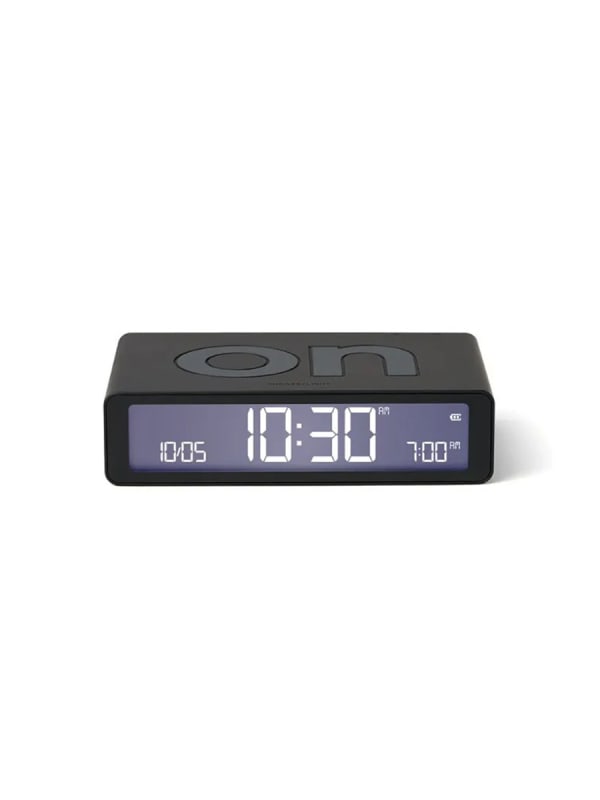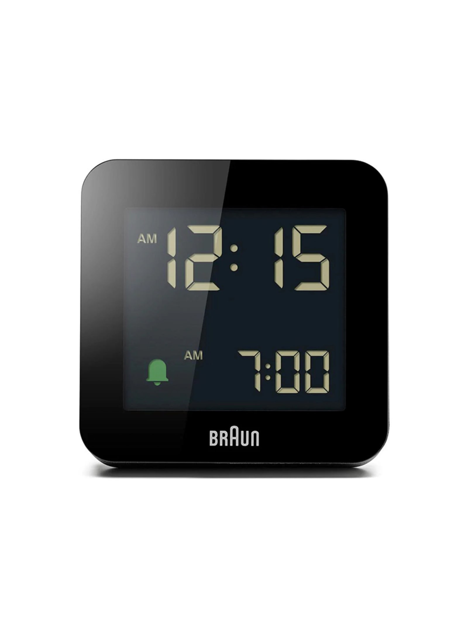
BC09 digital alarm clock / Braun
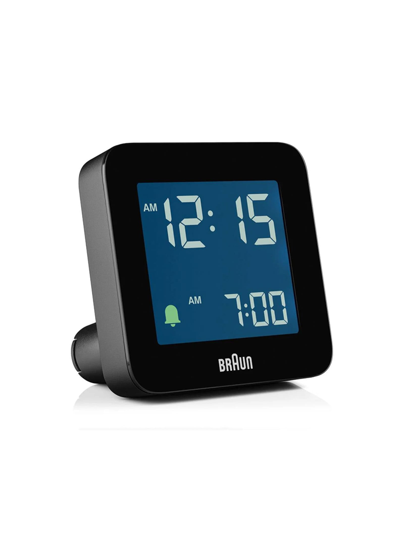
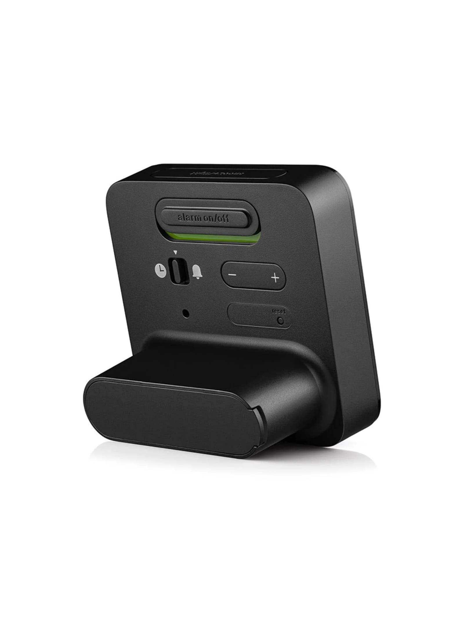
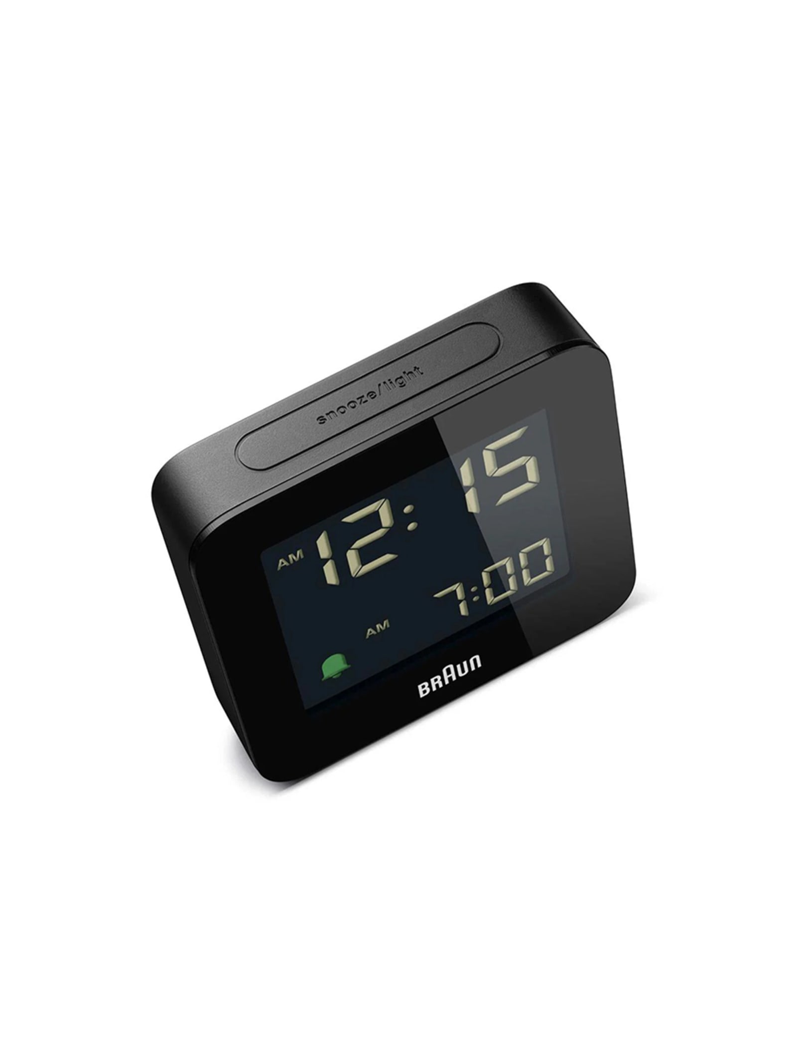
The BC09 is what Braun's less-but-better principle looks like applied to a digital alarm clock and nothing else. The 75.5mm square case carries a reverse LCD, light figures on a dark field, read at a glance rather than studied, and it won a Red Dot award in 2020. It updates the older BNC009 in response to user feedback, adding a crescendo alarm that builds gradually instead of jolting and a combined snooze and backlight button on top. Controls stay physical rather than touch-based, which is part of the point: it behaves identically every night, with no menus and no states to misread. A single AA cell runs it. There is no radio, no connectivity and no customisation, and that restraint is the whole design.
Design intent
- +The interface is kept mechanical rather than touch-sensitive, prioritising a clock that behaves the same way every time over one that merely looks more modern.
- +A crescendo alarm replaces the abrupt digital buzzer, waking gradually, a deliberate softening of the one moment the clock exists for.
Trade-offs
- -The reverse LCD, light on dark, is harder to read in dim conditions until the backlight is pressed.
- -There is no radio, projection or connectivity; the clock does one thing, which is the appeal, but it is the whole of what it offers.
Featured in / Collections
View allFeatured in / Editorials
View allRelated products
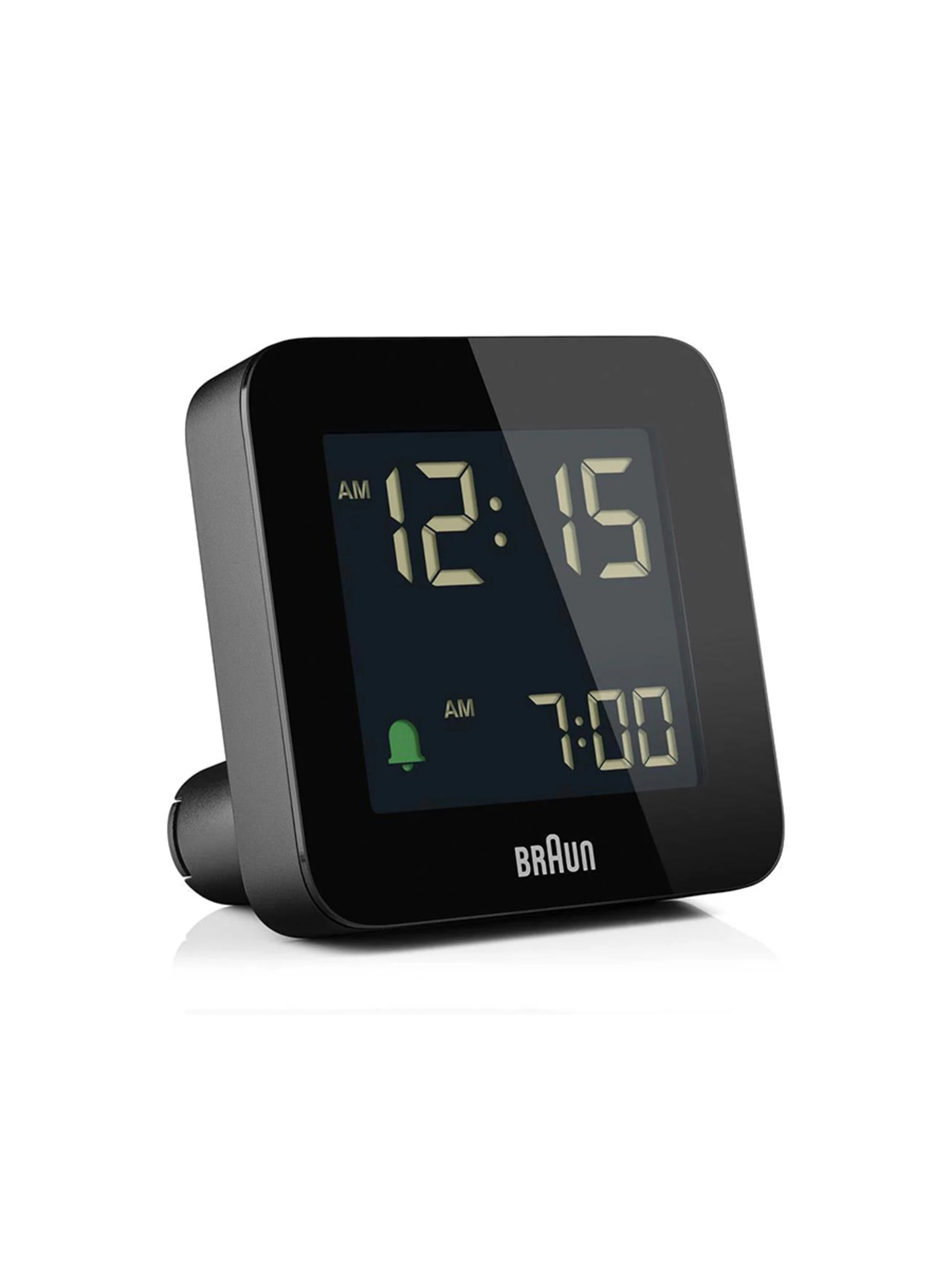
The BC09 is what Braun's less-but-better principle looks like applied to a digital alarm clock and nothing else. The 75.5mm square case carries a reverse LCD, light figures on a dark field, read at a glance rather than studied, and it won a Red Dot award in 2020. It updates the older BNC009 in response to user feedback, adding a crescendo alarm that builds gradually instead of jolting and a combined snooze and backlight button on top. Controls stay physical rather than touch-based, which is part of the point: it behaves identically every night, with no menus and no states to misread. A single AA cell runs it. There is no radio, no connectivity and no customisation, and that restraint is the whole design.
Design intent
- +The interface is kept mechanical rather than touch-sensitive, prioritising a clock that behaves the same way every time over one that merely looks more modern.
- +A crescendo alarm replaces the abrupt digital buzzer, waking gradually, a deliberate softening of the one moment the clock exists for.
Trade-offs
- -The reverse LCD, light on dark, is harder to read in dim conditions until the backlight is pressed.
- -There is no radio, projection or connectivity; the clock does one thing, which is the appeal, but it is the whole of what it offers.