7 Watches That Tell the Time Better Than Your Smartwatch
- 24 Sept 2025
- 24 Sept 2025
- 6 min
Smartwatches are useful. They consolidate messages, health data, navigation, payments, and reminders into a single device. For many people, that convenience is hard to argue against. But usefulness and clarity are not the same thing.
A traditional watch performs one task. It tells the time. There are no notifications layered beneath the display, no vibrations competing for interpretation, no software state waiting to be checked. The interaction begins and ends with a glance.
The watches in this list are not nostalgic alternatives to technology. They represent different approaches to a narrow brief: numeric precision, graphic legibility, mechanical rhythm, material permanence, reduced precision. Each one prioritises time in a specific way and limits everything else.
In doing so, they often tell the time more clearly than a smartwatch ever can.
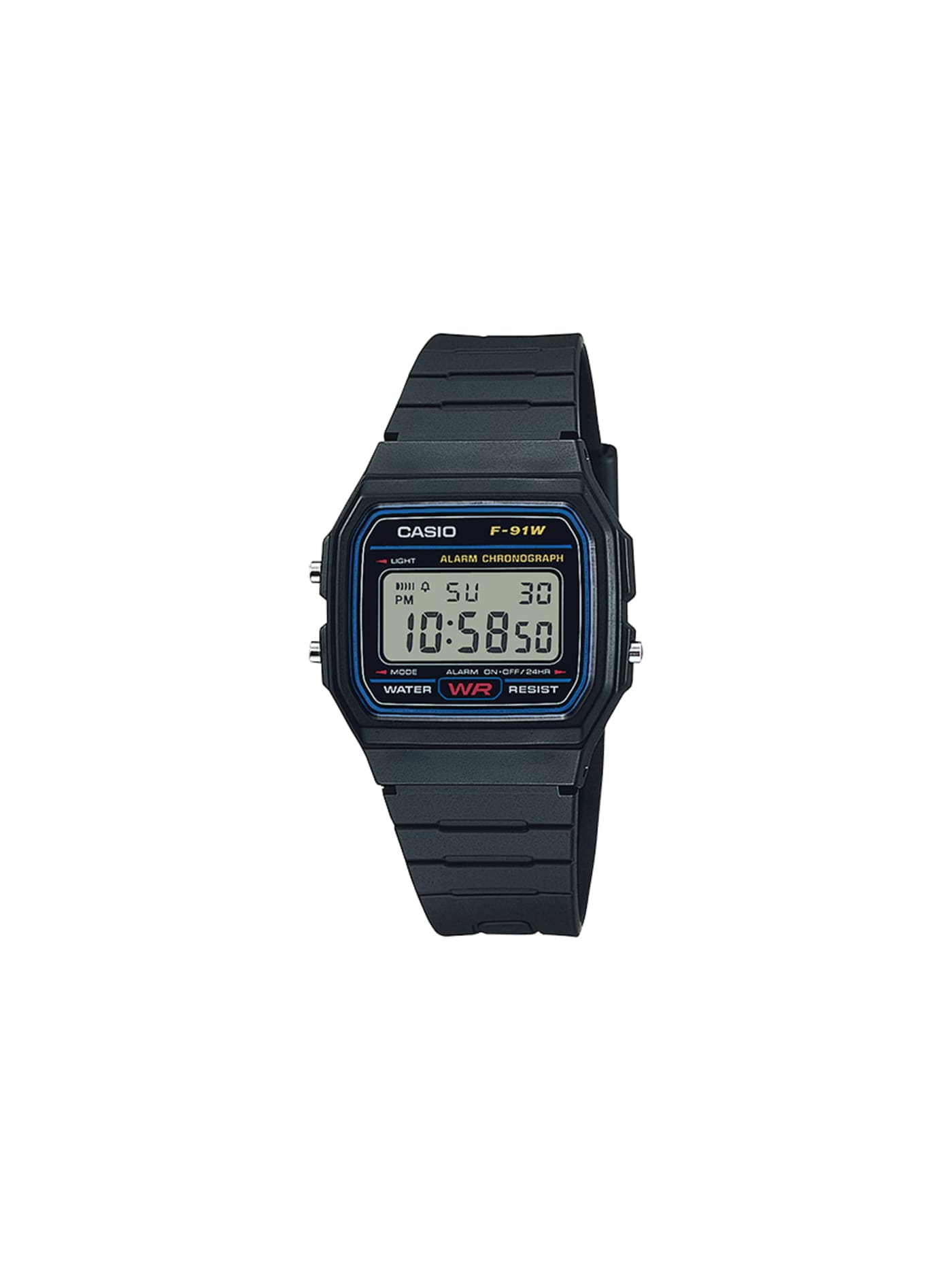
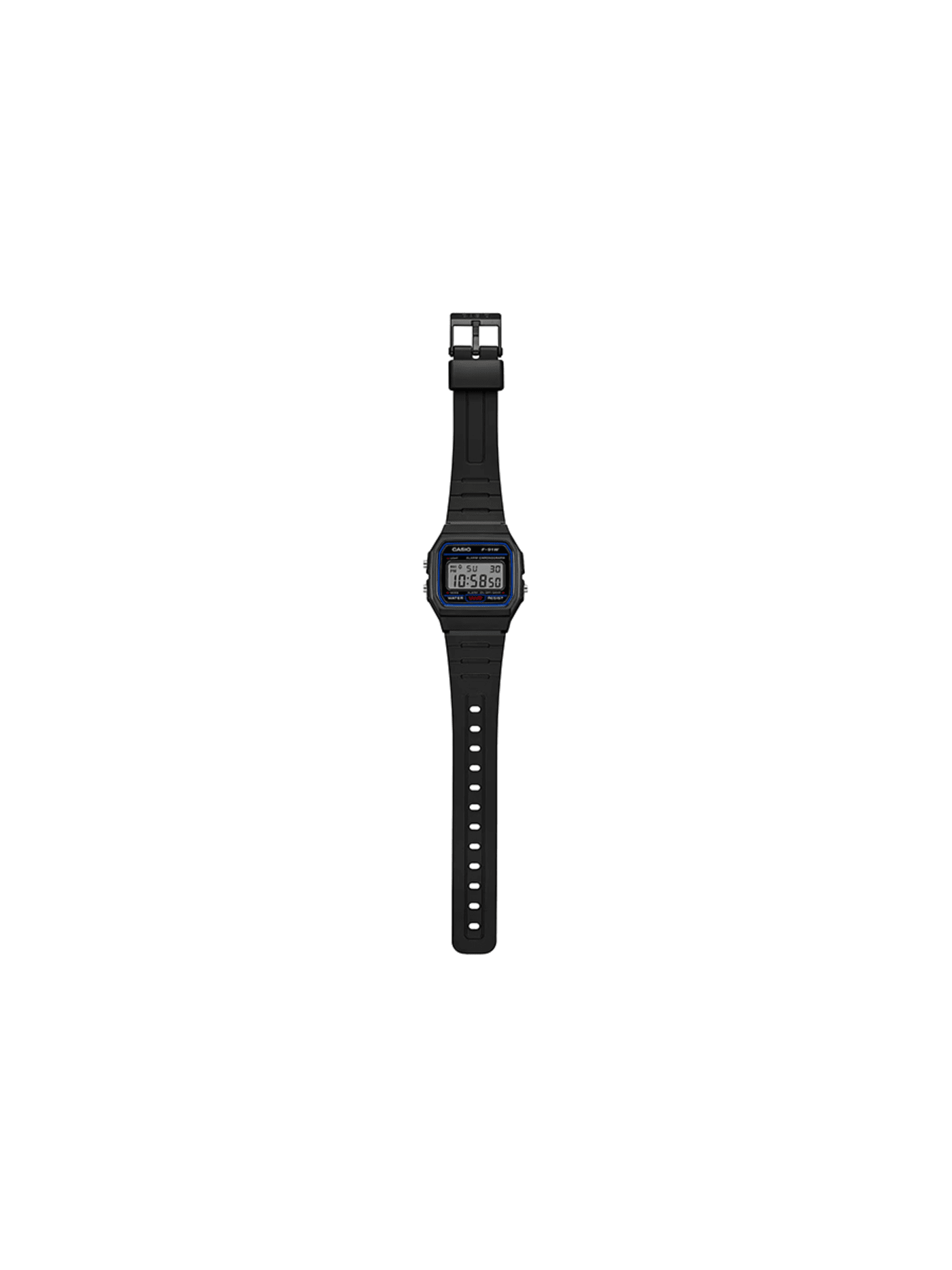
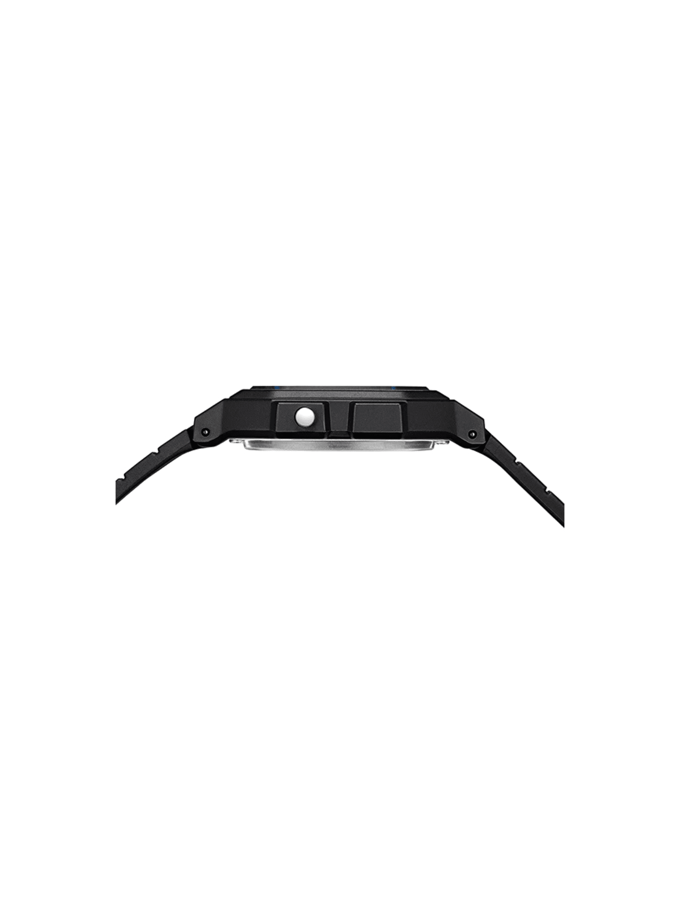
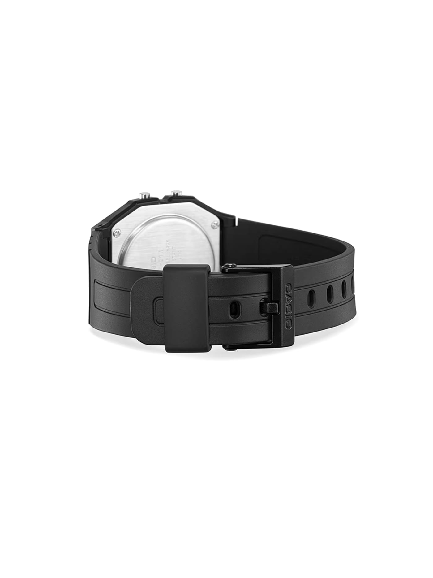
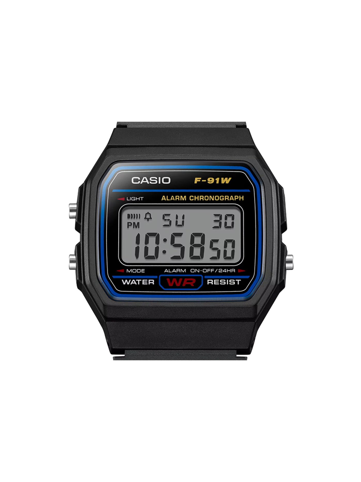
The F-91W removes interpretation entirely. Time is presented numerically, without scale, texture, or decorative hierarchy. There is no dial to read and no second hand to follow. You glance, you register, you move on. It proves something quietly important: digital timekeeping does not require connectivity. The watch runs in the background without demanding anything. There are no notifications layered beneath the display, no interaction pathways that extend beyond the task. It is inexpensive, lightweight, and easily replaceable. That lack of ceremony reduces friction further. The F-91W does not try to elevate time. It simply shows it.
Design intent
- Low cost and low weight are treated as features rather than compromises: a watch cheap enough that losing it carries no real penalty.
- The entire interface is three buttons with their functions printed on the face, operable without instructions and unchanged for over thirty years.
Trade-offs
- The resin case and acrylic crystal scratch easily, and the backlight is too dim to be useful in true darkness.
- No luminous hands, shallow water resistance, and a strap that grows brittle after years of UV exposure: predictable limits at the price.
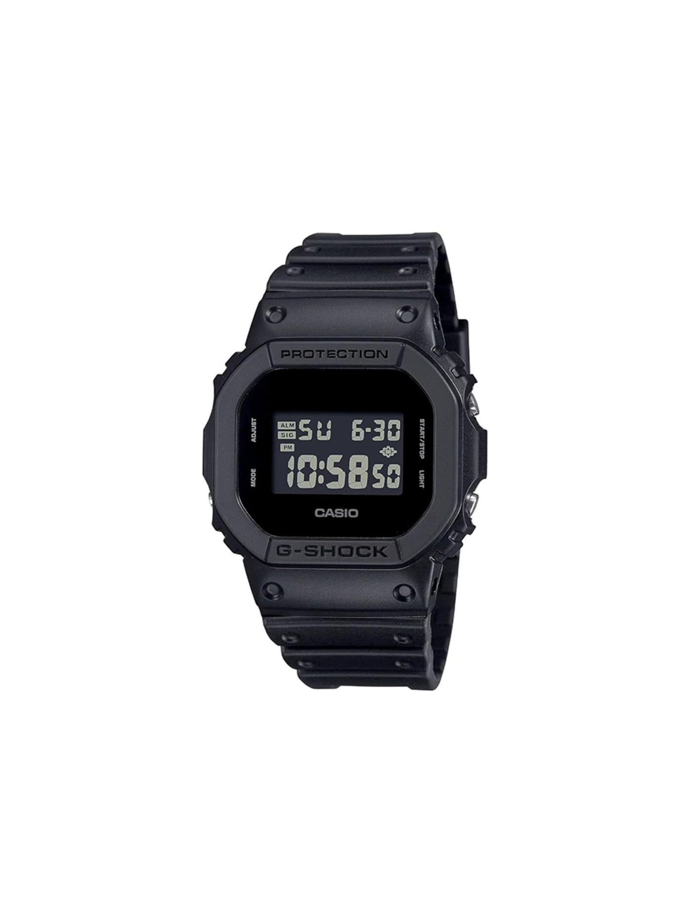
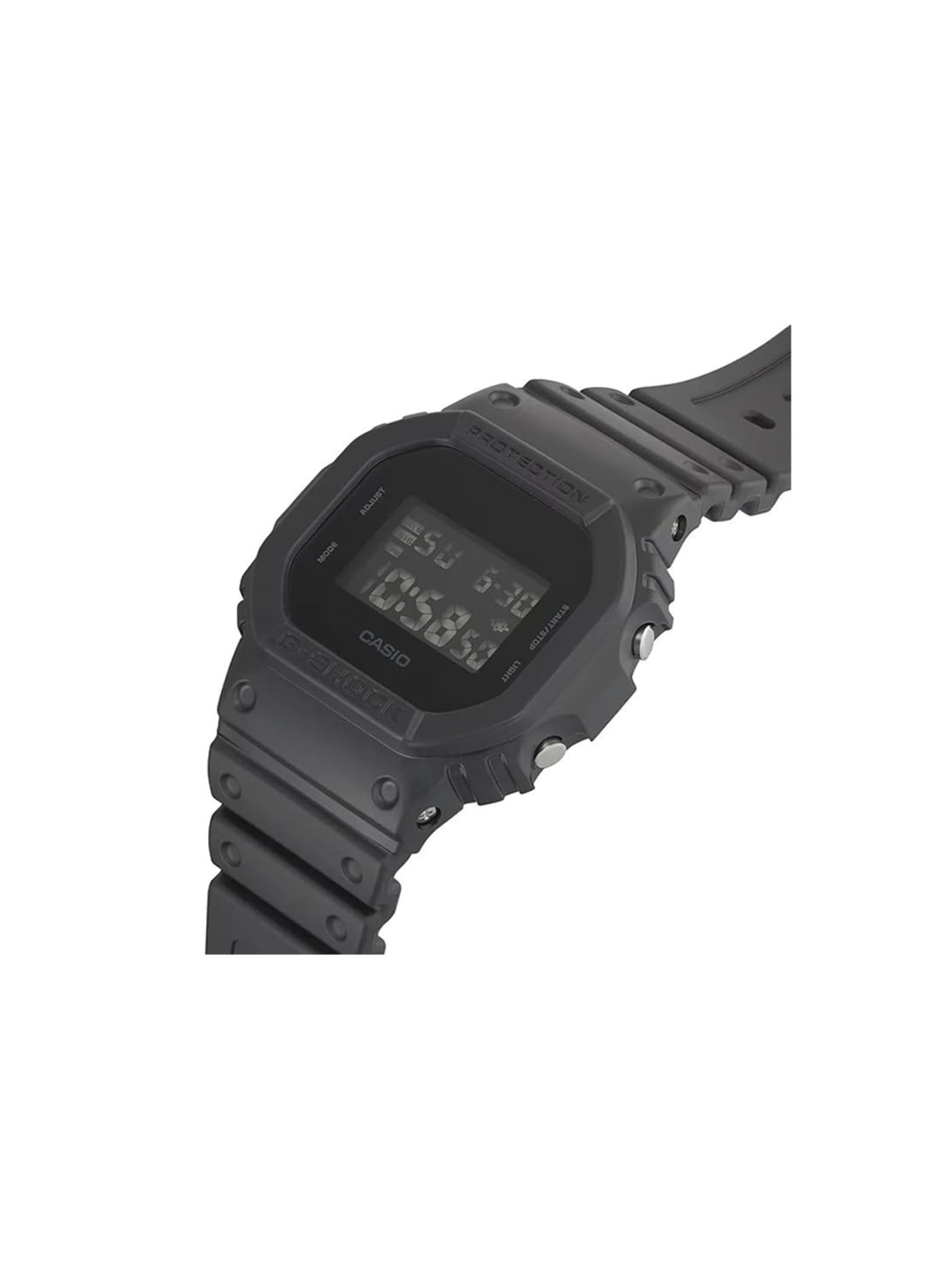
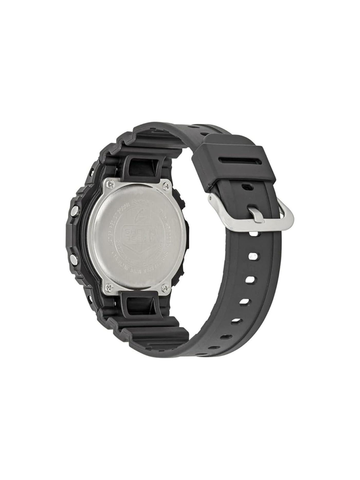
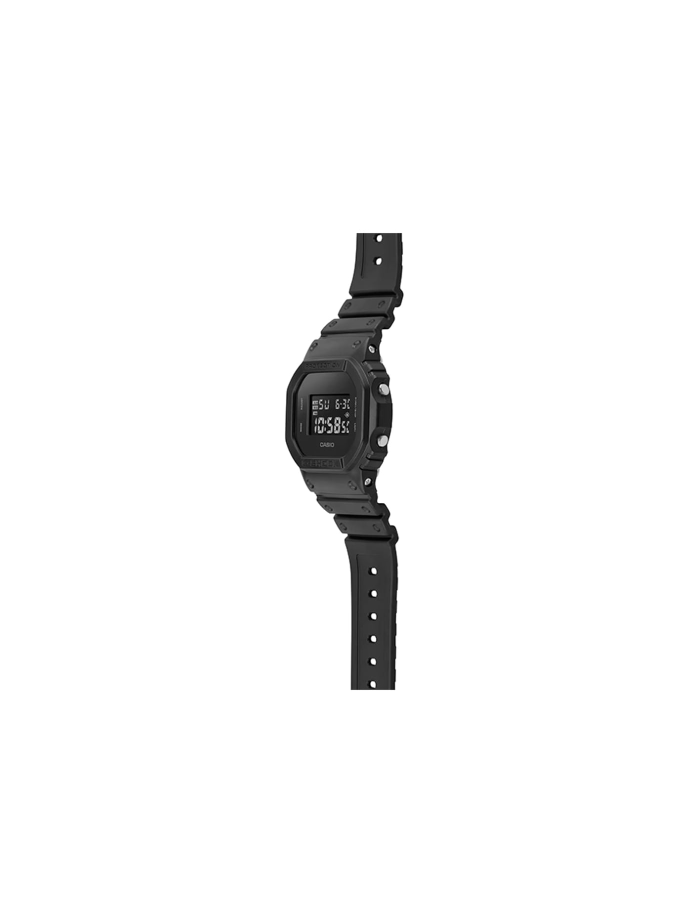
The DW-5600 reduces cognitive load through durability. It is built to absorb impact without recalibration or concern. That stability changes the relationship between wearer and object. You do not manage it. You rely on it. The display is high contrast and unapologetically functional. No refinement is layered over the readout. It exists to remain legible under movement, vibration, and stress. Unlike a smartwatch, which ties performance to charging cycles and software states, the DW-5600 operates as a sealed instrument. Its presence is assertive. Its function is singular.
Design intent
- Shock resistance is the organising principle: the module floats inside a hollow resin case on minimal contact points, so impact is absorbed by the structure before it reaches the electronics.
- The raised bezel protects the crystal and the buttons sit recessed against accidental presses, with the square silhouette kept largely unchanged across decades as a form treated as already resolved.
Trade-offs
- The recessed buttons and dated menu logic make setting functions fiddly compared with a modern interface.
- The mineral crystal scratches more readily than sapphire, and the integrated strap limits aftermarket options without adapters.
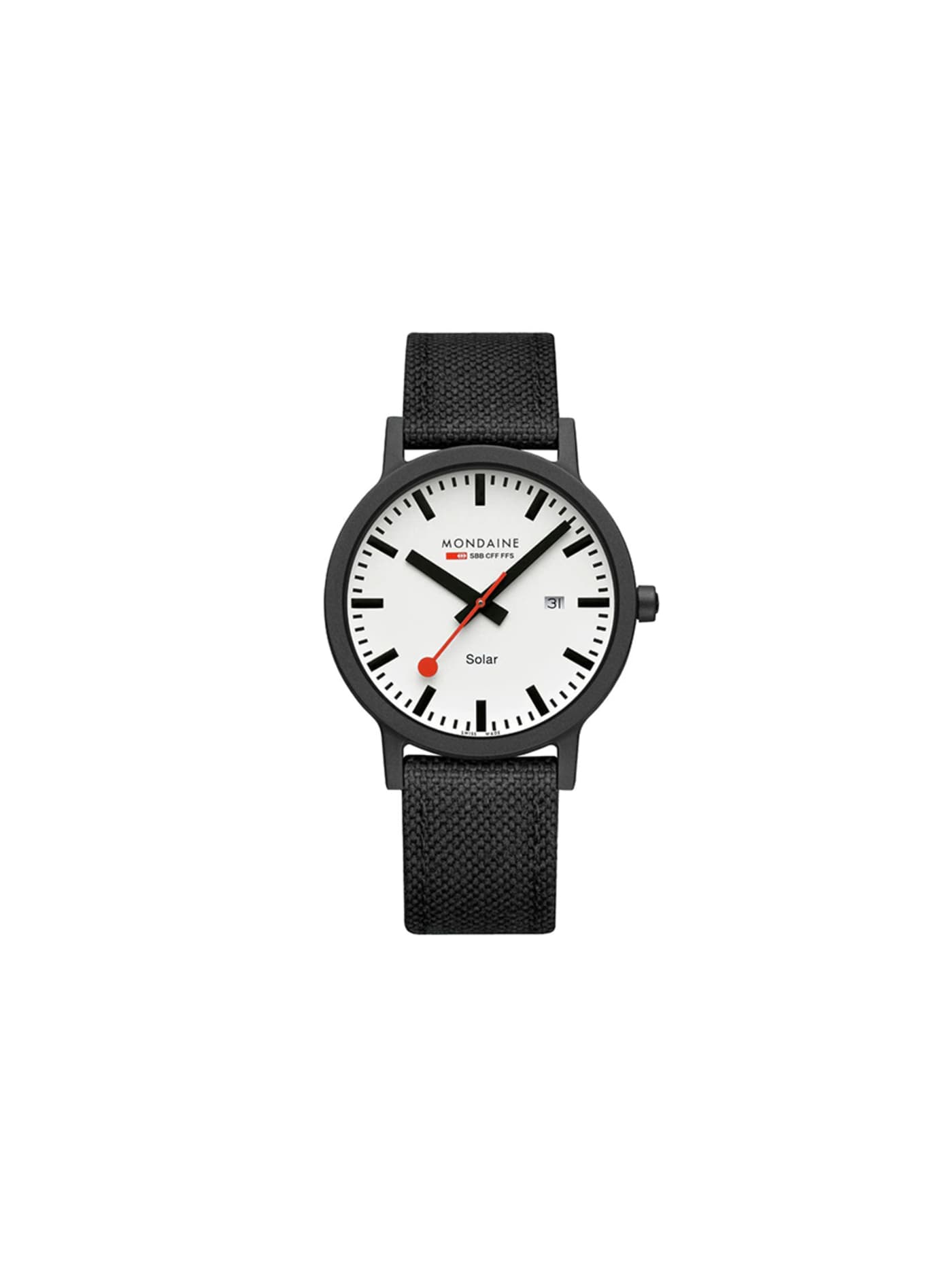
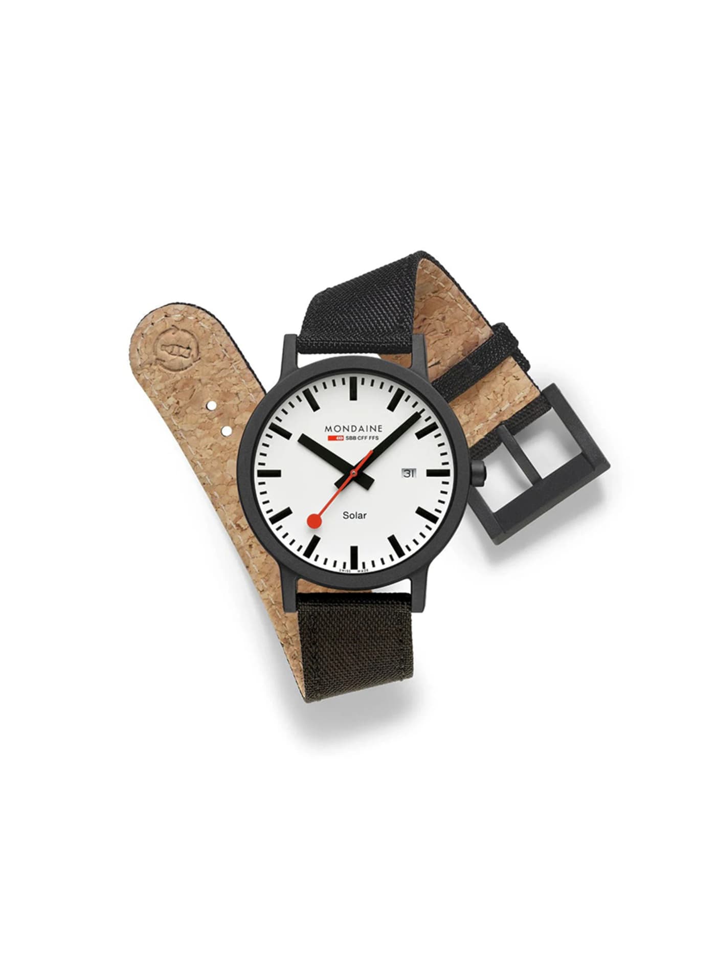
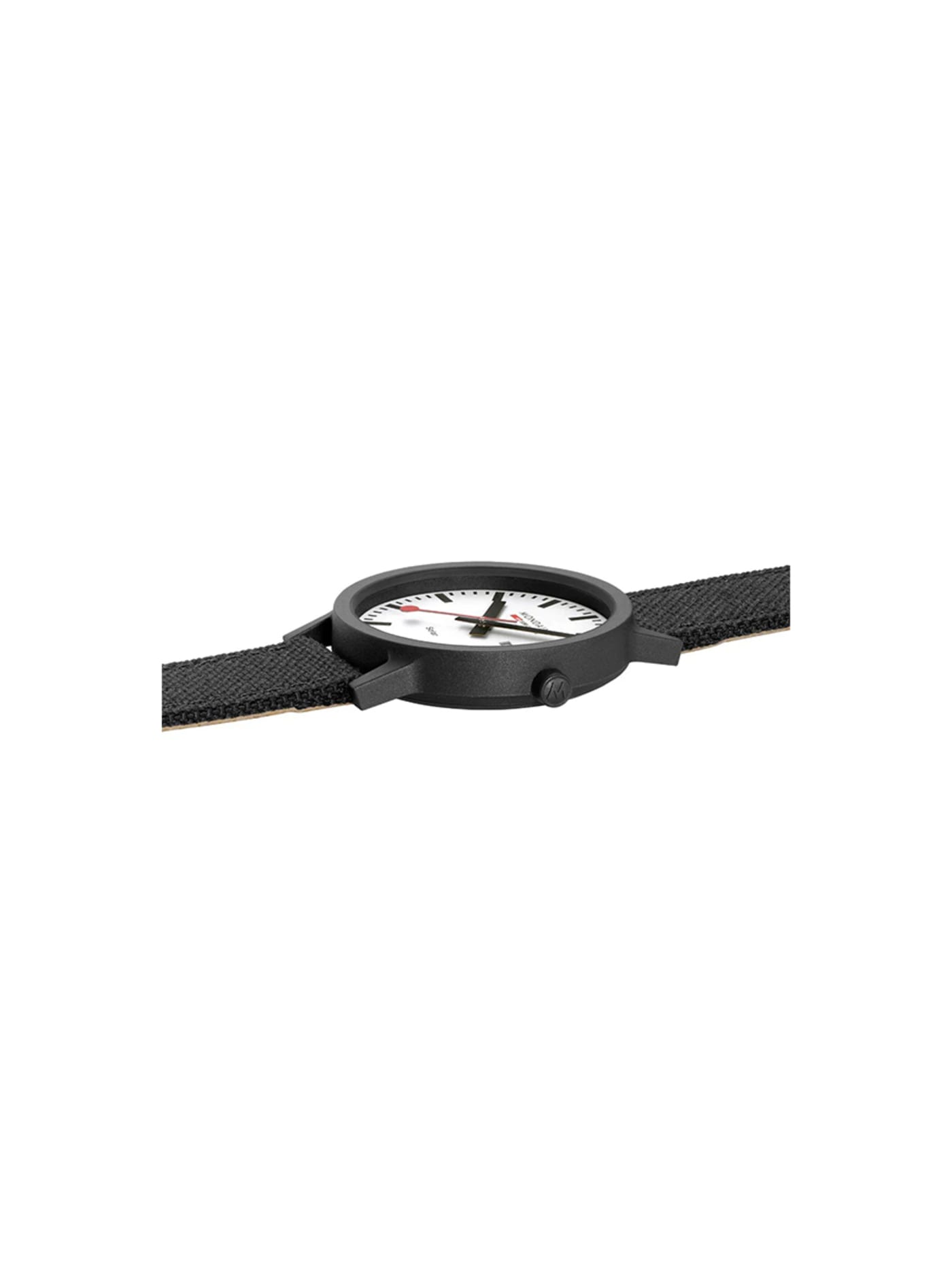
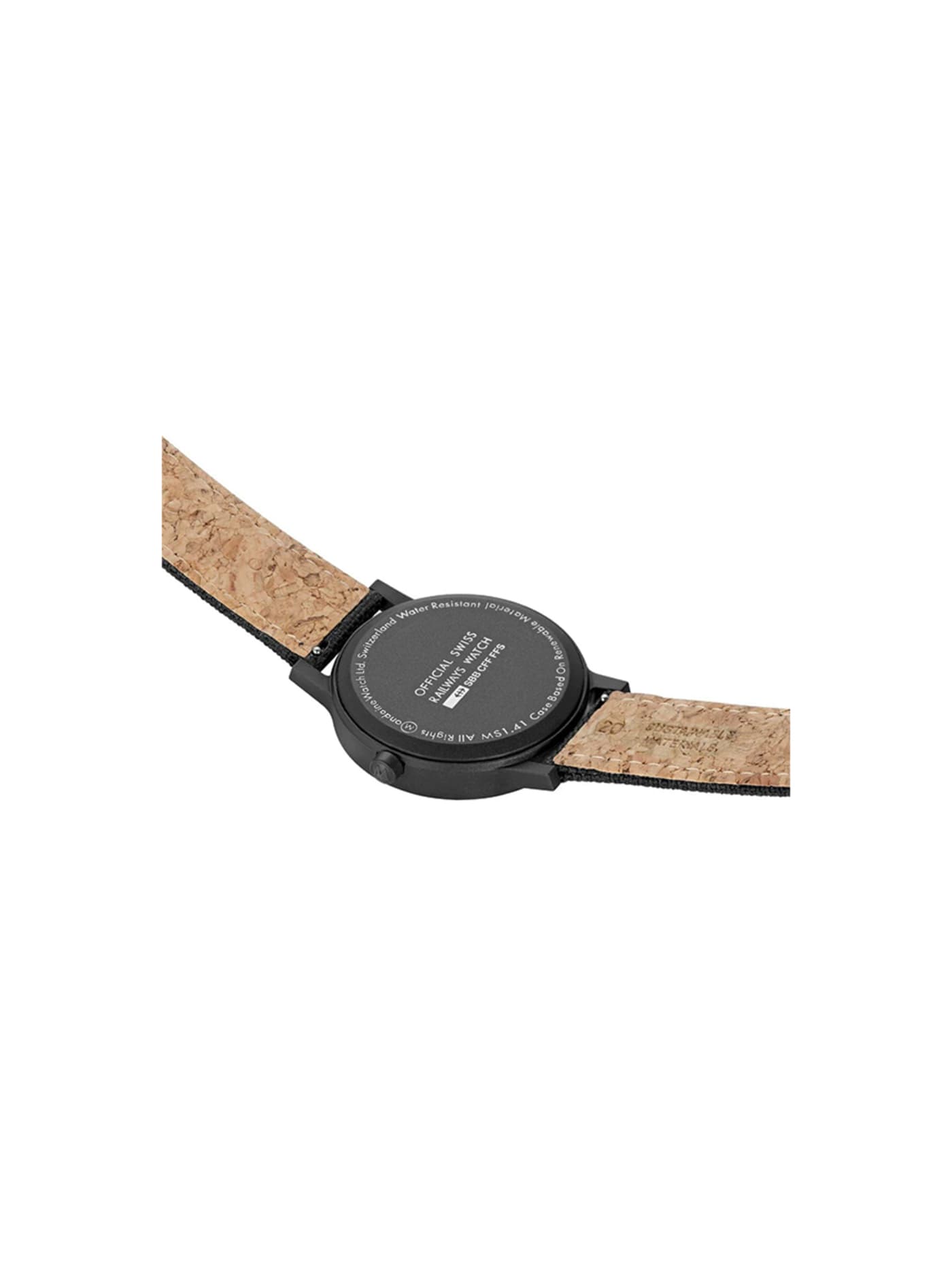
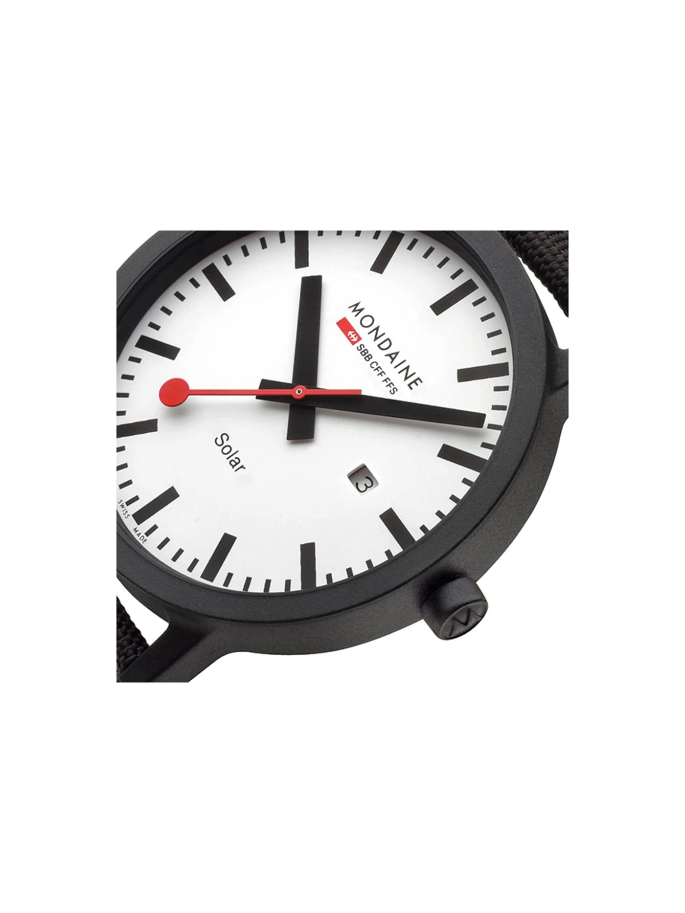
The Mondaine dial was designed to be read from across a platform. That origin matters. The minute track is clear. The hour markers are deliberate. The red seconds hand provides orientation without clutter. This is graphic clarity rather than stylistic minimalism. Every element serves a communicative purpose. There is no decorative layering competing with the information. Where a smartwatch adds depth through menus and notifications, this dial flattens the experience. Time is presented as infrastructure. Neutral, immediate, and unambiguous.
Design intent
- It carries a public design icon onto the wrist intact, keeping the station clock's exact graphic identity rather than reinterpreting it.
- Renewable and recycled materials run through case, strap and packaging, and solar power removes battery replacement entirely, while the original dial legibility is preserved.
Trade-offs
- The bio-composite case looks and feels like the plastic it largely is, which may read as less premium despite the environmental logic.
- Water resistance is a modest 30 metres, and the mineral crystal scratches more easily than sapphire.
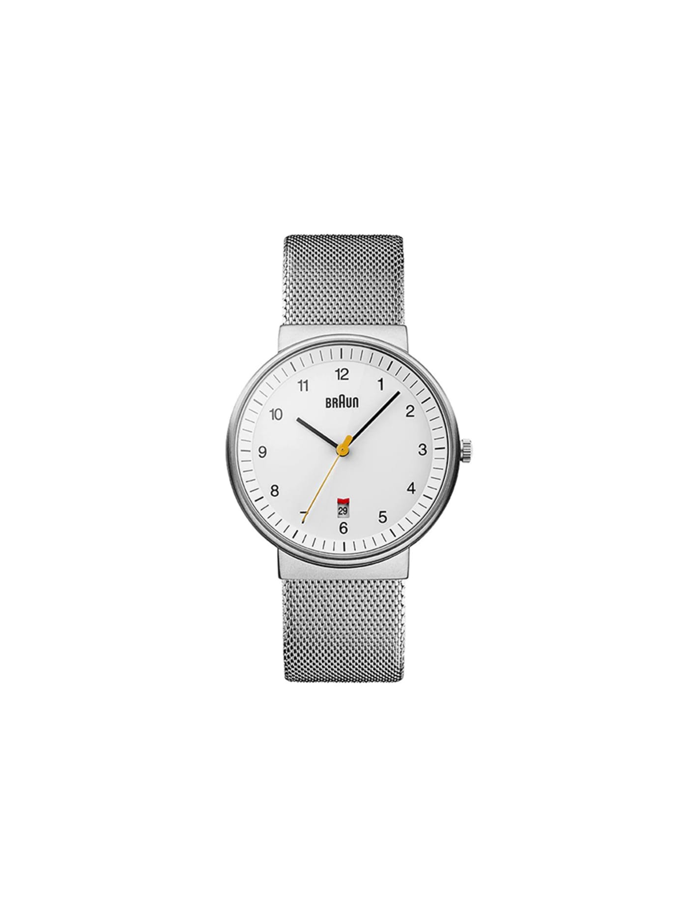
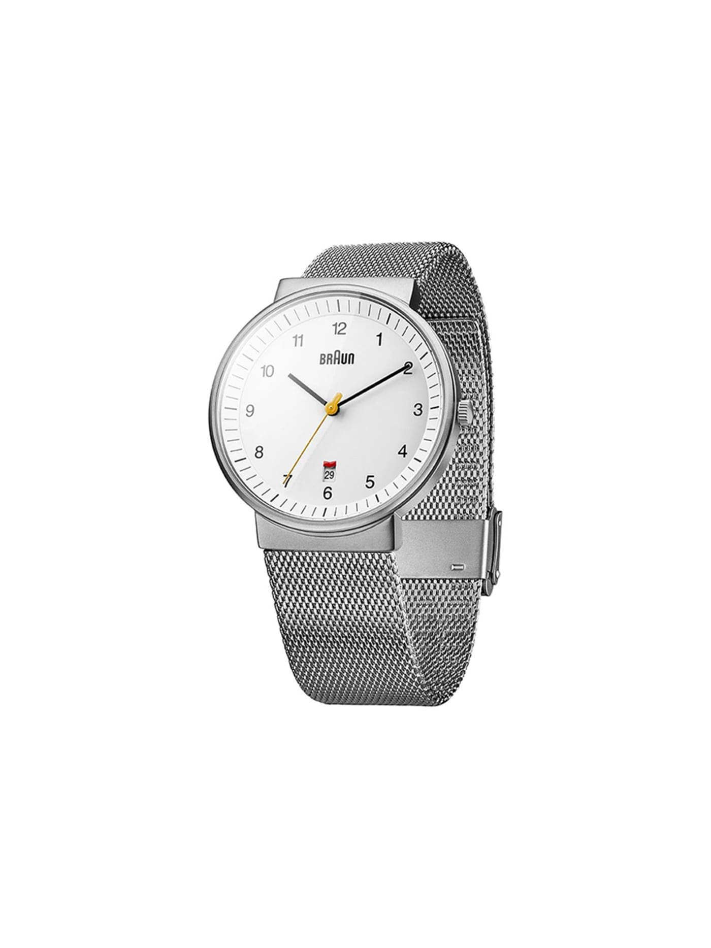
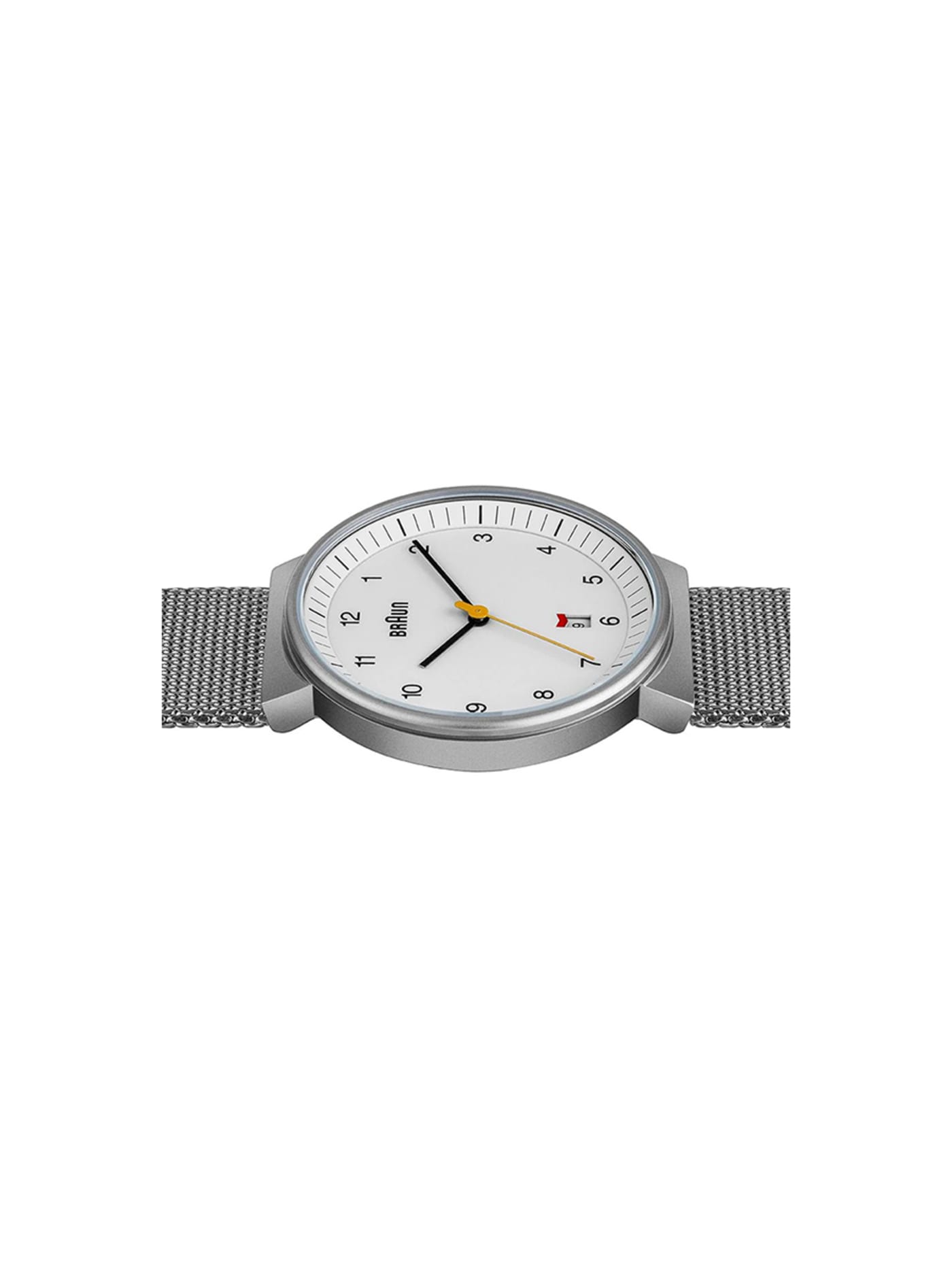
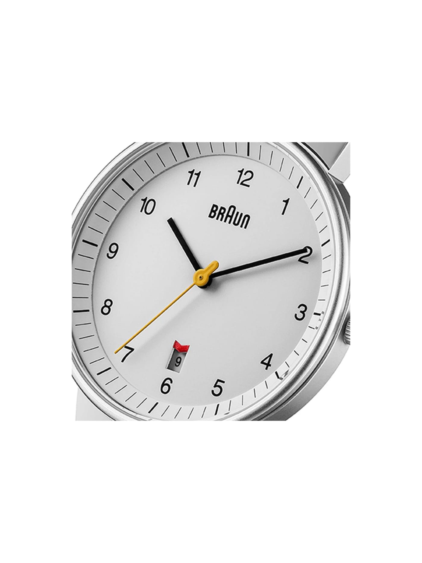
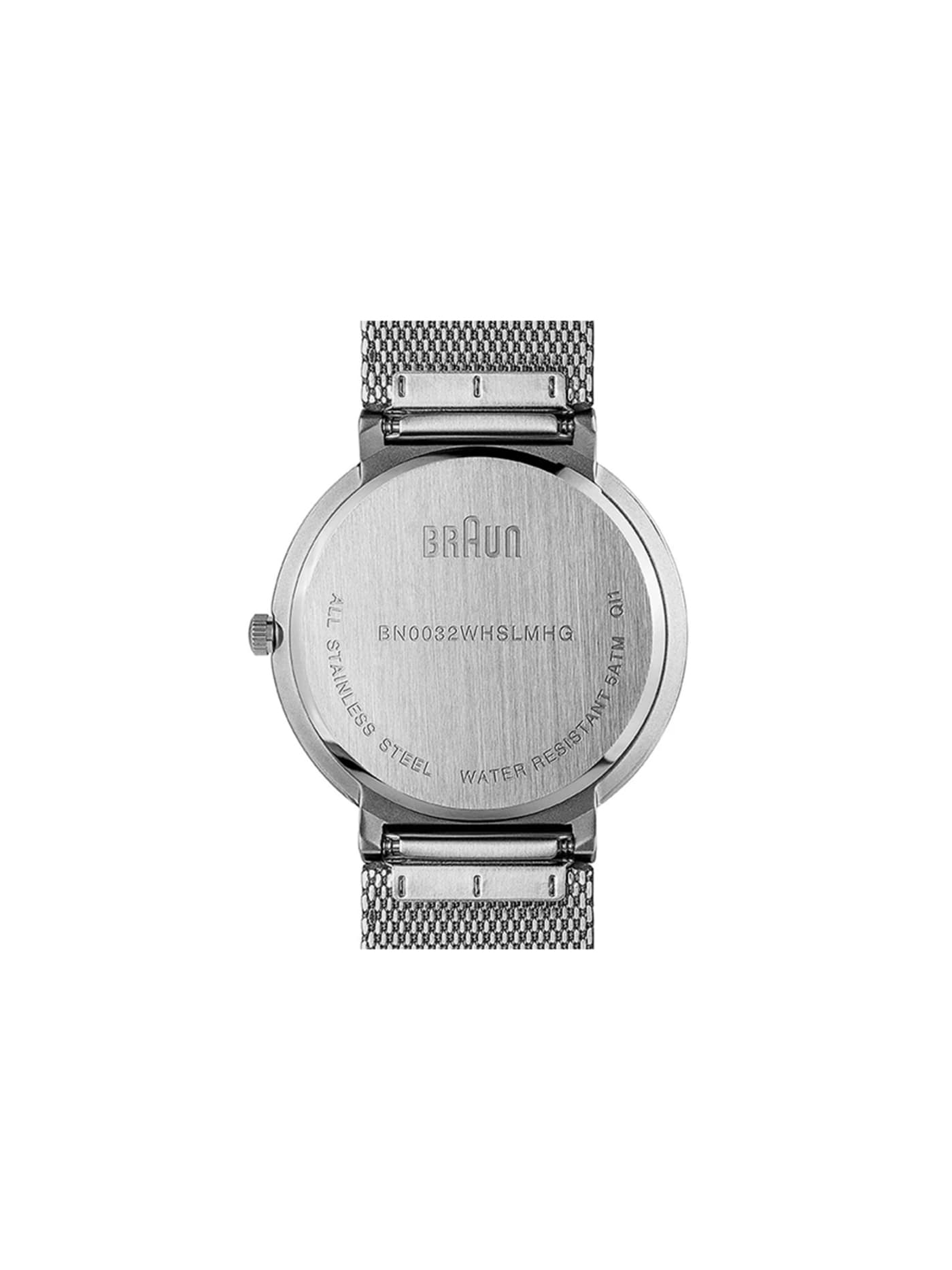
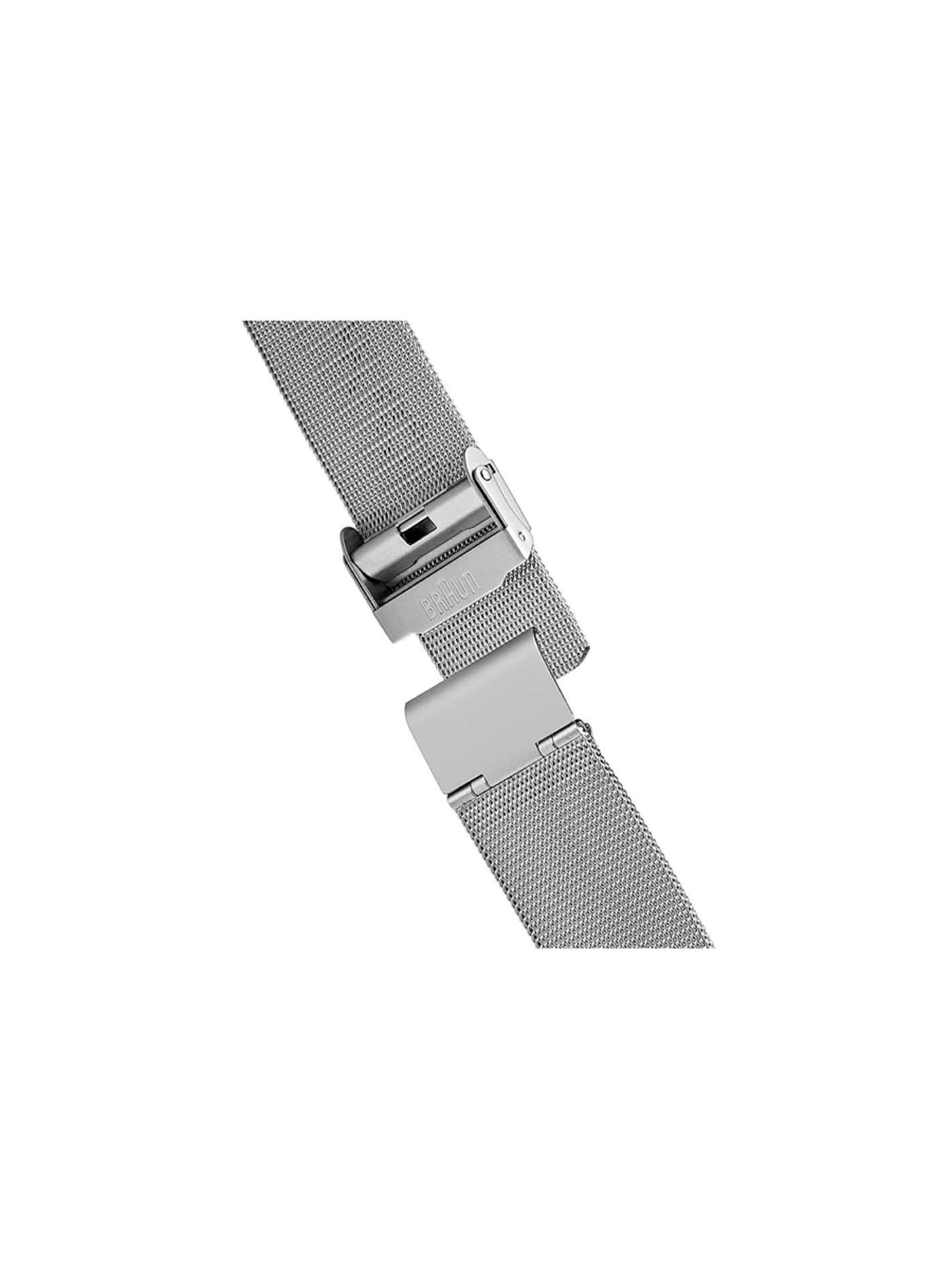
The BN0032 applies the same design logic Braun brought to its clocks and radios: nothing on the dial that does not need to be there. The typography is clear, the indices are minimal, and the layout has a calmness that most watch dials never achieve. Dieter Rams' influence on the design language is legible without being imitative. The quartz movement keeps timekeeping predictable and maintenance-free. This is not a watch that rewards close inspection of its mechanism. It rewards the experience of wearing something visually settled, day after day. For those who find mechanical watches too ceremonial and smartwatches too demanding, the BN0032 occupies a considered middle position. It does what a watch should do, and looks like it always knew that was enough.
Design intent
- It applies Braun's design language directly: contrasting hands and bold numerals are tuned for instant legibility rather than ornament.
- The case is kept thin and flat so the watch sits unobtrusively under a cuff, treating discretion as part of the brief.
Trade-offs
- The quartz movement and mineral crystal place it as a design object rather than a horological one; there is no mechanism to admire.
- Its restraint can read as plain next to similarly priced mechanical watches that offer more to look at.
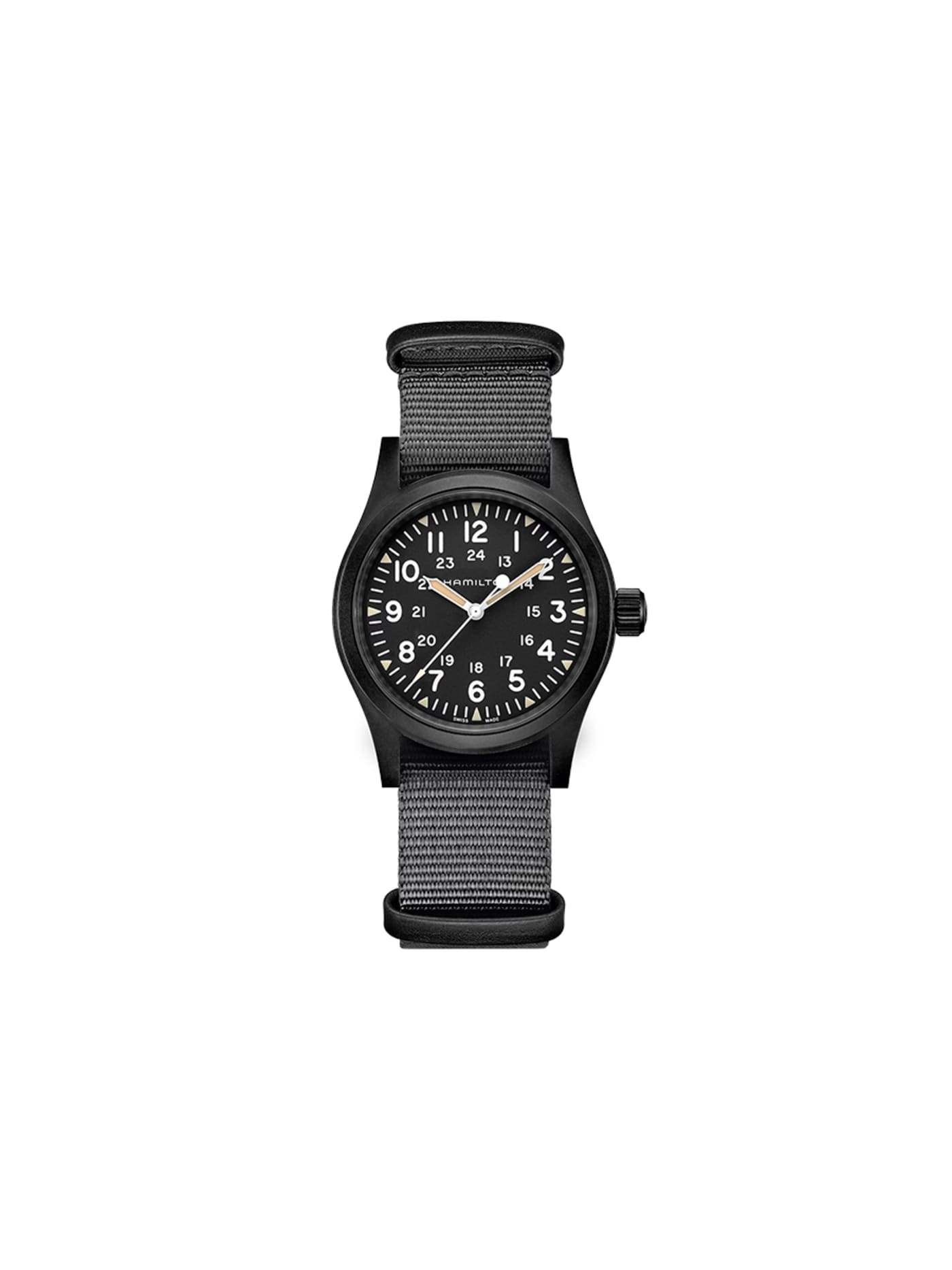
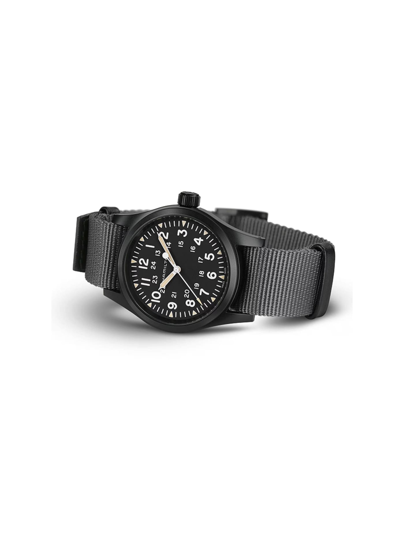
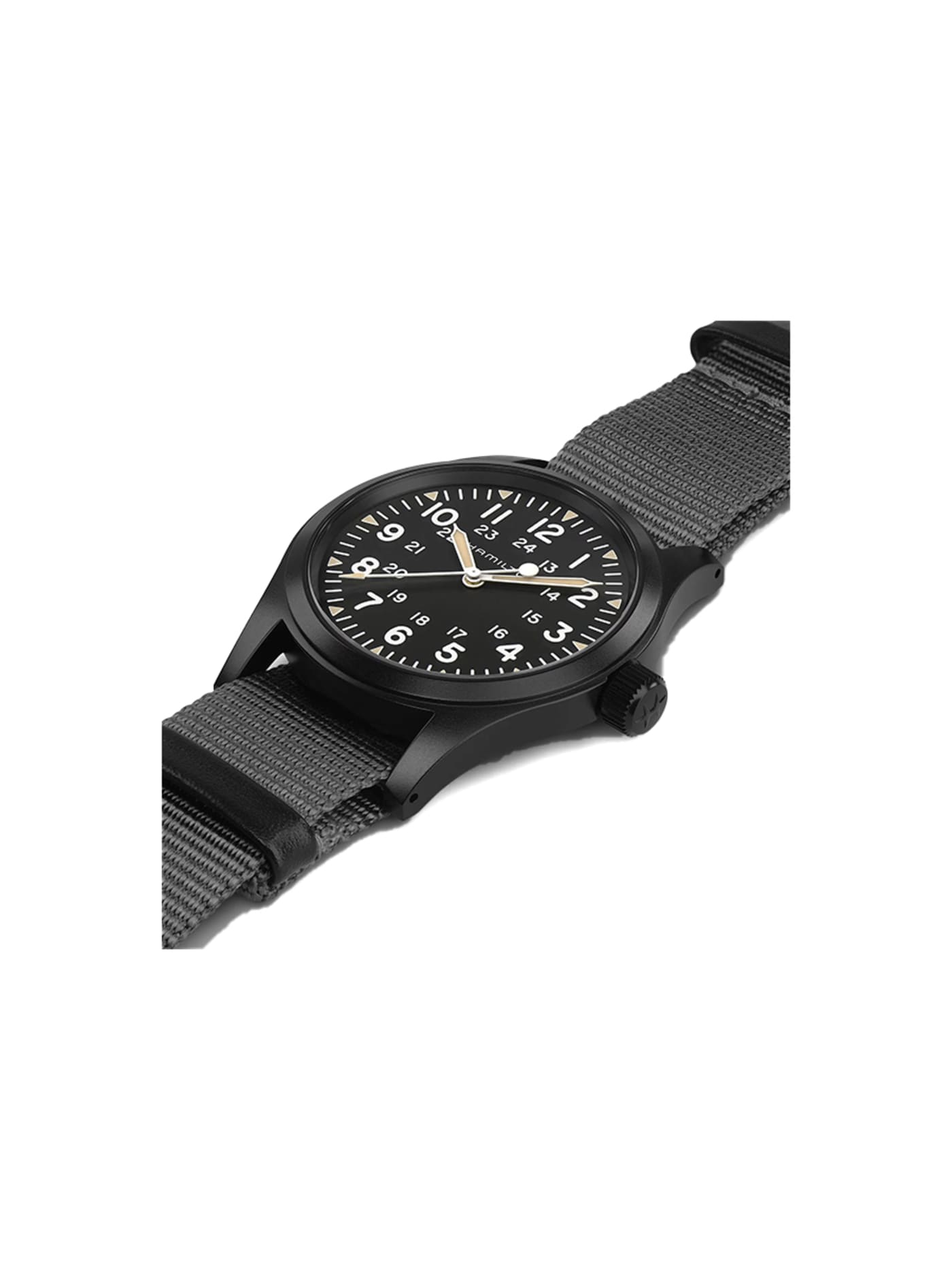
The Khaki Field Mechanical is structured around legibility under constraint. The matte dial reduces reflection. The inner 24-hour track supports orientation without crowding the primary numerals. Hand-winding introduces a small ritual. That physical engagement reinforces the singular purpose of the object. There is no battery state to monitor, no screen brightness to adjust, no software to update. It is not ornate and it is not delicate. It is built around clarity during movement. Compared to the layered interface of a smartwatch, the interaction is direct. You wind it, you wear it, you read it. Nothing else competes.
Design intent
- It recreates a military-specification field watch with modern materials and a notably long 80-hour reserve, keeping the austere, legibility-first dial of the original.
- The matte sandblasted case is finished to arrive already looking worn-in, so the first scratches carry no anxiety; the watch is meant to be used.
Trade-offs
- Water resistance is 50 metres, modest for a tool watch, a consequence of the slim case and push-pull crown.
- It must be hand-wound, with no rotor, no date and no quartz convenience, which is part of the ritual for some and a daily chore for others.
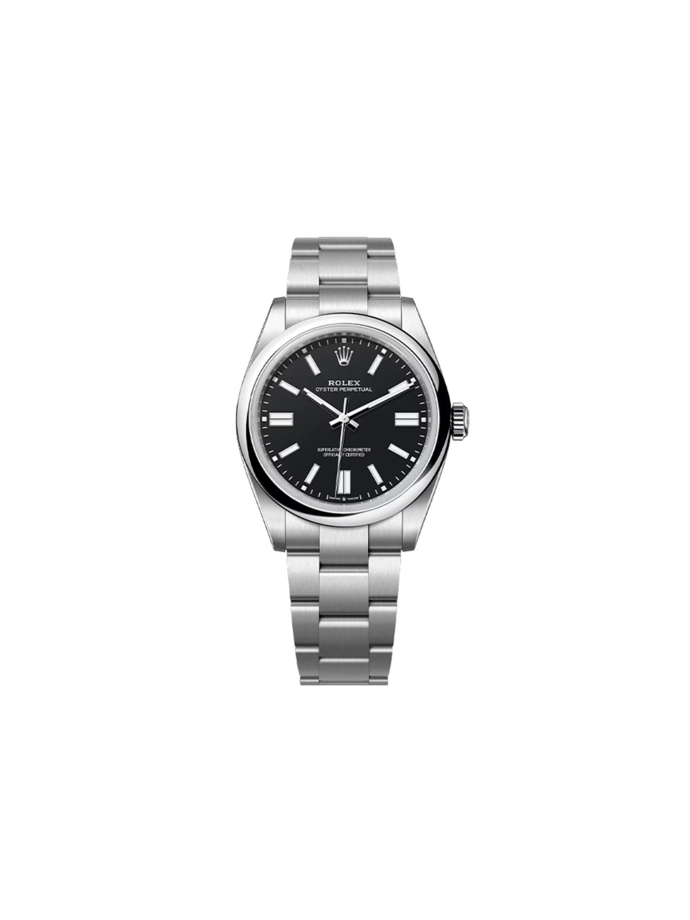
The Oyster Perpetual removes complication at exactly the level where complication is most expected. There is no date aperture. No rotating bezel. No additional scales. The dial is clean, luminous, and evenly spaced. The case architecture prioritises durability. Water resistance and structural robustness are built in rather than advertised. This is permanence presented as a matter of course. A smartwatch competes through capability. The Oyster Perpetual competes through restraint. It demonstrates that premium does not require more functions — it requires resolution. The watch shows the time clearly, consistently, and without negotiation.
Design intent
- Stripping the watch to a waterproof case, a perpetual rotor and a clean time display states the original Rolex proposition without distraction: the restraint is the design, not an omission.
- In-house alloys, a paramagnetic hairspring and Superlative Chronometer certification push accuracy to within about two seconds a day, accuracy doing the work complications do on other watches.
Trade-offs
- Its price sits alongside watches offering far more visible mechanical complexity, so the value is in materials, finish and certification rather than features on the dial.
- Supply through authorised dealers stays tight, which feeds a secondary-market premium driven by demand rather than by anything in the watch itself.
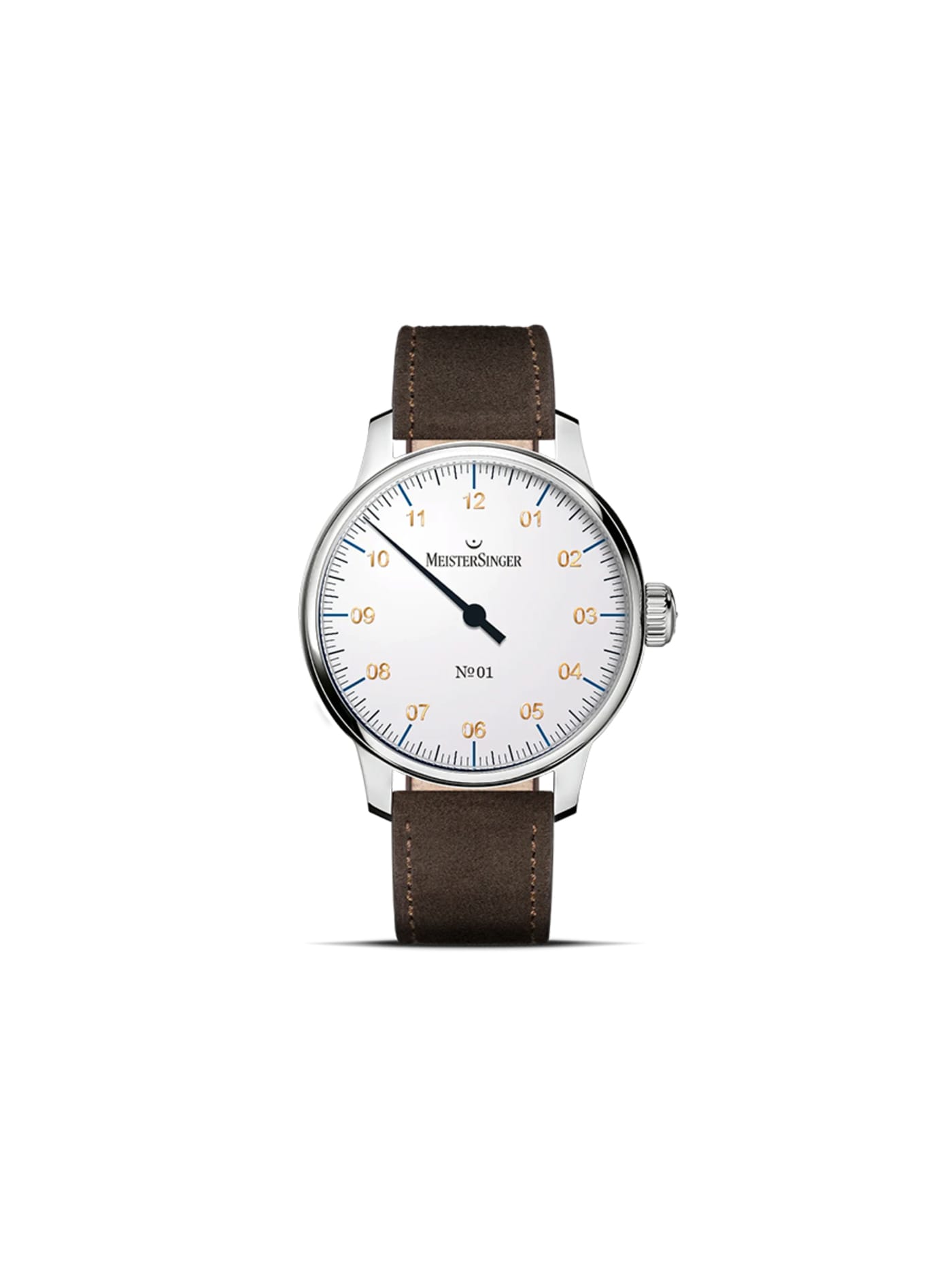
The MeisterSinger No.01 reduces precision deliberately. It displays time with a single hand, encouraging estimation rather than exactitude. That constraint shifts the relationship between wearer and watch in a way that is hard to explain until you have worn one. A smartwatch measures time down to the second while simultaneously fragmenting attention across notifications and health data. The No.01 moves in the opposite direction. It removes seconds entirely. Minutes are implied rather than declared. The dial is uncluttered, but not minimal for effect. It simply avoids resolution that is not required. It does not compete on features. It competes on perspective.
Design intent
- Reducing the dial to one hand treats five-minute resolution as the entire point: a slower, more deliberate relationship with time rather than a limitation to apologise for.
- Oversized double-digit typography and an uncluttered dial make a single-hand readout intuitive at a glance, and the hand-wound movement reinforces the once-a-day ritual.
Trade-offs
- Five-minute resolution is genuinely impractical for anyone whose day runs on punctuality to the minute.
- There is no luminous material on the standard models, so the watch is effectively unreadable in the dark.
Final thoughts
A smartwatch turns your wrist into an interface. That can be productive. It can also be continuous. Every glance carries the possibility of something more: a message, a headline, a prompt to respond.
A dedicated watch does not offer that extension. It offers orientation. You look, you register the time, and the interaction ends. That boundary is subtle, but it accumulates over days and months.
The question is not whether smartwatches are capable. They are. The question is what you want from the object you check dozens of times a day. Expansion or reduction. Precision or perspective.
Timekeeping can be an interruption, or it can be a reference point. The difference often lies in what the device is allowed to do.