12 Well-Designed Products You Can Buy for Almost Nothing
- 14 May 2026
- 14 May 2026
- 12 min
You can usually tell the cheap one from the expensive one with your eyes shut. Weight, the density of a material, the precision of a seam. The instinct that associates quality with price is not foolish, and most of the time it is right.
But price and design quality are different things, and a small group of objects pulls them cleanly apart. The full case for why is made in a separate essay; the short version is that scale edits a mass-made object to the bone, a small budget cannot afford to disguise itself with fancy extras, and decades of production test a design more thoroughly than any premium launch or marketing. What survives that process is sometimes close to perfect because after all, pressure makes diamonds... This is not a list of bargains. It is a list of objects that happen to cost almost nothing and have not been improved on in fifty years or more.
Each entry is viewed the way the rest of the archive is viewed, through the six design lenses: what it is for, what it prioritises, what it gives up. The only difference is that, in every case below, the price is the last thing worth knowing about the design.
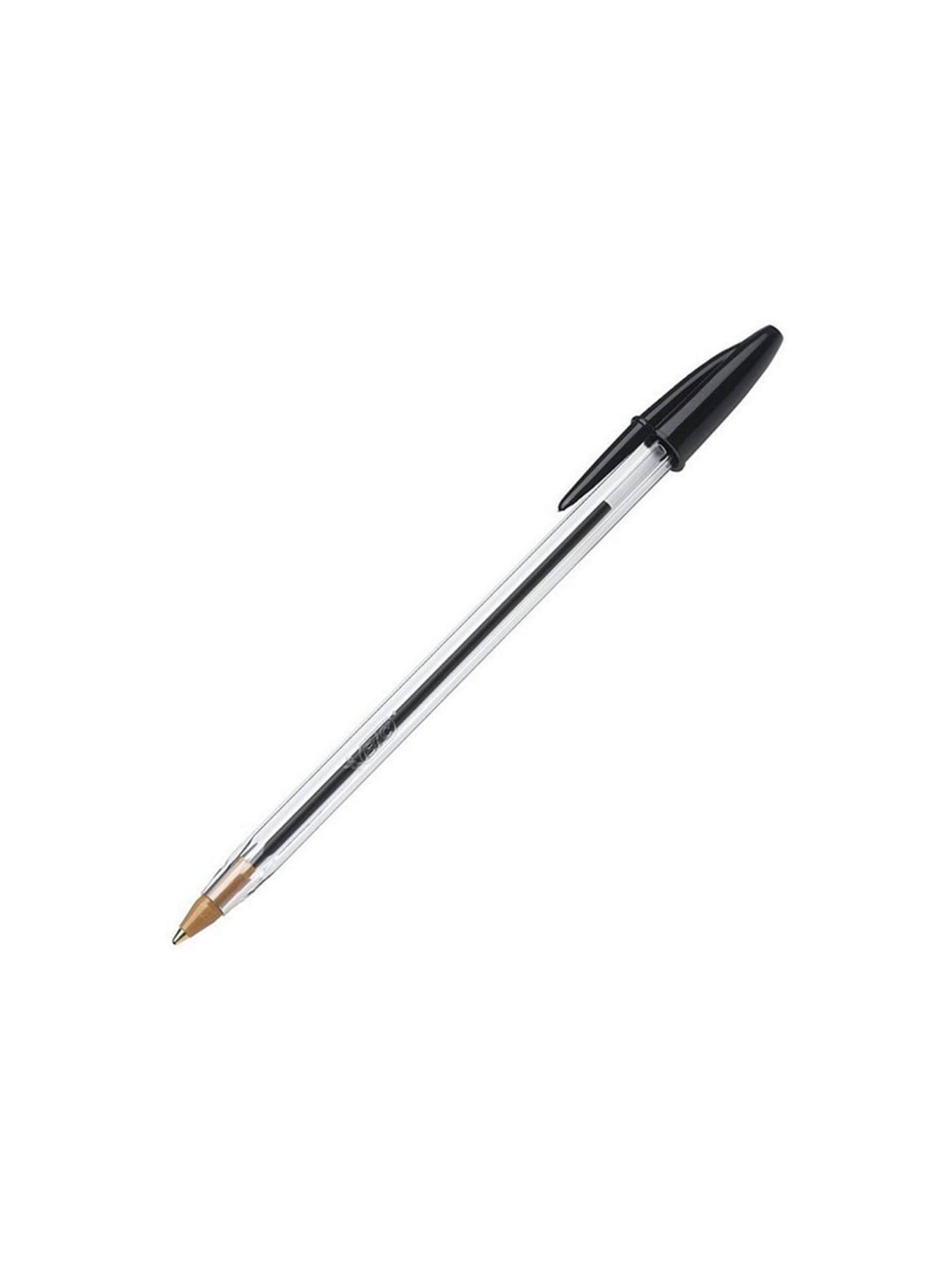
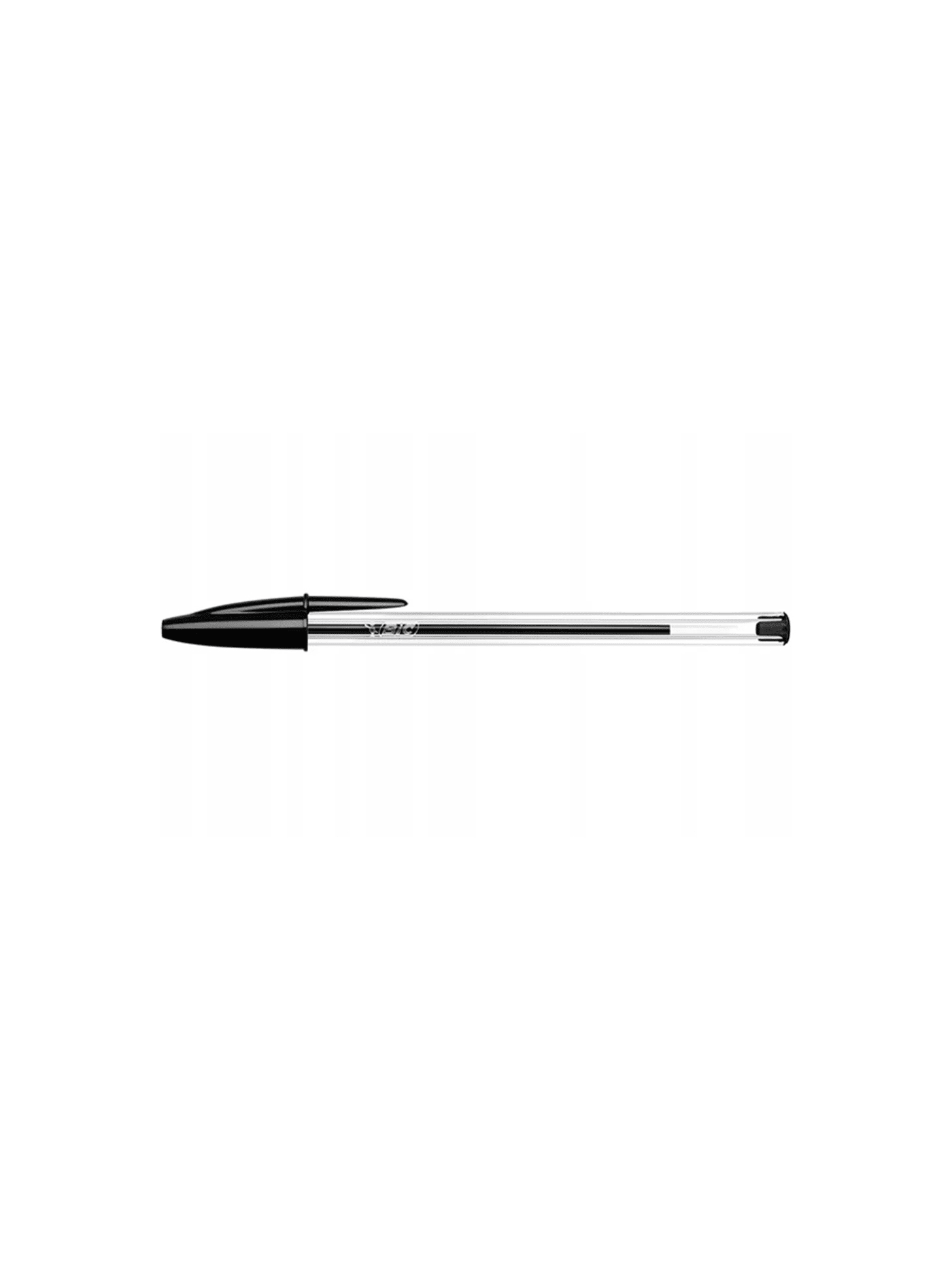


The clearest demonstration of the whole argument, and the reason it opens the list. Every feature is functional and none is decorative, because at a scale measured in billions a decorative feature is a decorative feature reproduced billions of times. The hexagonal barrel is borrowed from the pencil, so the pen will not roll off a desk and the fingers find grip. A vent in the cap and a small hole in the barrel equalise pressure so the ink flows evenly. The body is transparent so the ink level is legible without opening anything. It sits in the Museum of Modern Art's collection and costs less than anything else here. The limitation, one refill and then the bin, is the position, not a shortcoming.
Design intent
- The hexagonal barrel, taken from the wooden pencil, does four jobs at once: it stiffens a thin moulding, provides three natural grip points, stops the pen rolling off a desk, and uses less plastic than a round tube of the same strength.
- A tiny hole in the side of the barrel keeps the air pressure inside equal to the air outside, which is what lets the ink feed steadily and the pen write in any orientation without flooding or drying back.
Trade-offs
- It is disposable by design: nothing about it invites refilling or repair, so a spent pen is simply thrown away. Multiplied across the billions made, that throwaway logic is the design's real cost.
- The firm tip and light plastic body prioritise consistency and price over writing feel. It will not satisfy anyone who wants the weight, line variation or ceremony of a better pen, and it does not pretend to.


A folding knife of five parts: a beechwood handle, a blade, a pivot, a fixed collar and the rotating Virobloc ring that locks the blade open. Joseph Opinel drew the shape in 1890; his family added the Virobloc in 1955 and changed almost nothing else. That restraint is the design. There is no bolster, no liner lock, no second blade. A carbon or stainless edge in a handle shaped to the hand, and a locking ring that costs almost nothing to make and rarely fails. It was once called a peasant's knife, and in 1985 the V&A hung it beside the Porsche 911 and a Rolex as one of a hundred of the best-designed objects in the world. The beech will move with damp if it is neglected. That is the price of wood, honestly paid.
Design intent
- The knife is reduced to five simple parts and a single material logic, wood and steel, so it is cheap to make, easy to understand and endlessly maintainable: the blade resharpens for a lifetime and every component is legible, with nothing sealed or disposable.
- The Virobloc ring, added in 1955, solved the folding knife's core safety problem with almost nothing: a twist of a collar locks the blade open in use and shut in the pocket, adding real safety and versatility without complicating the object or its price.
Trade-offs
- The thin, elegant blade and the absence of a finger guard suit food and light tasks, not heavy work: it is not built to pry or baton, and there is no one-handed opening, so it asks to be used for what it is.
- The beechwood handle moves with humidity and can swell if left wet, occasionally making the blade stick, so it rewards hand-washing and drying and punishes the dishwasher, a small maintenance cost that comes with a natural material.

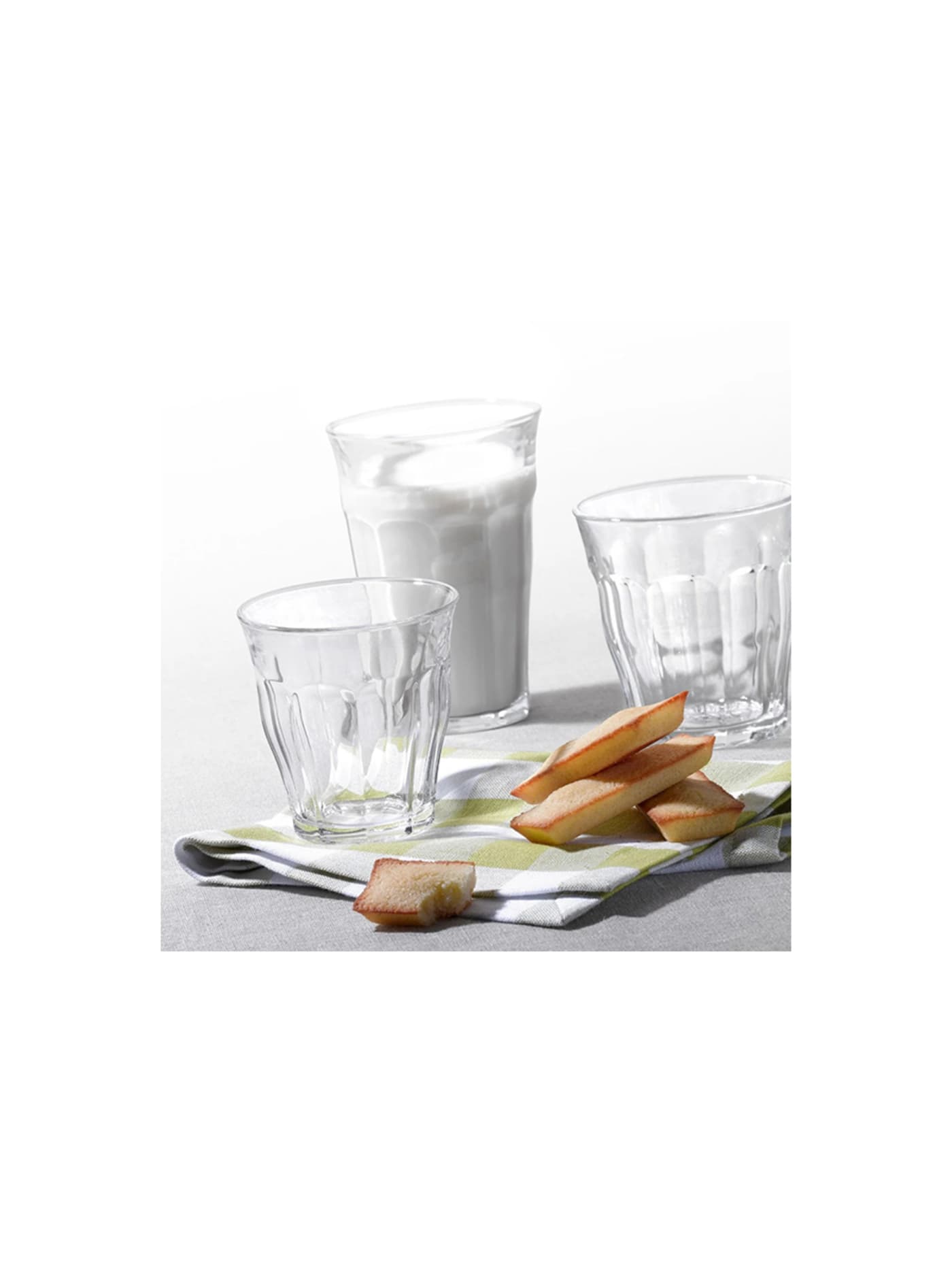
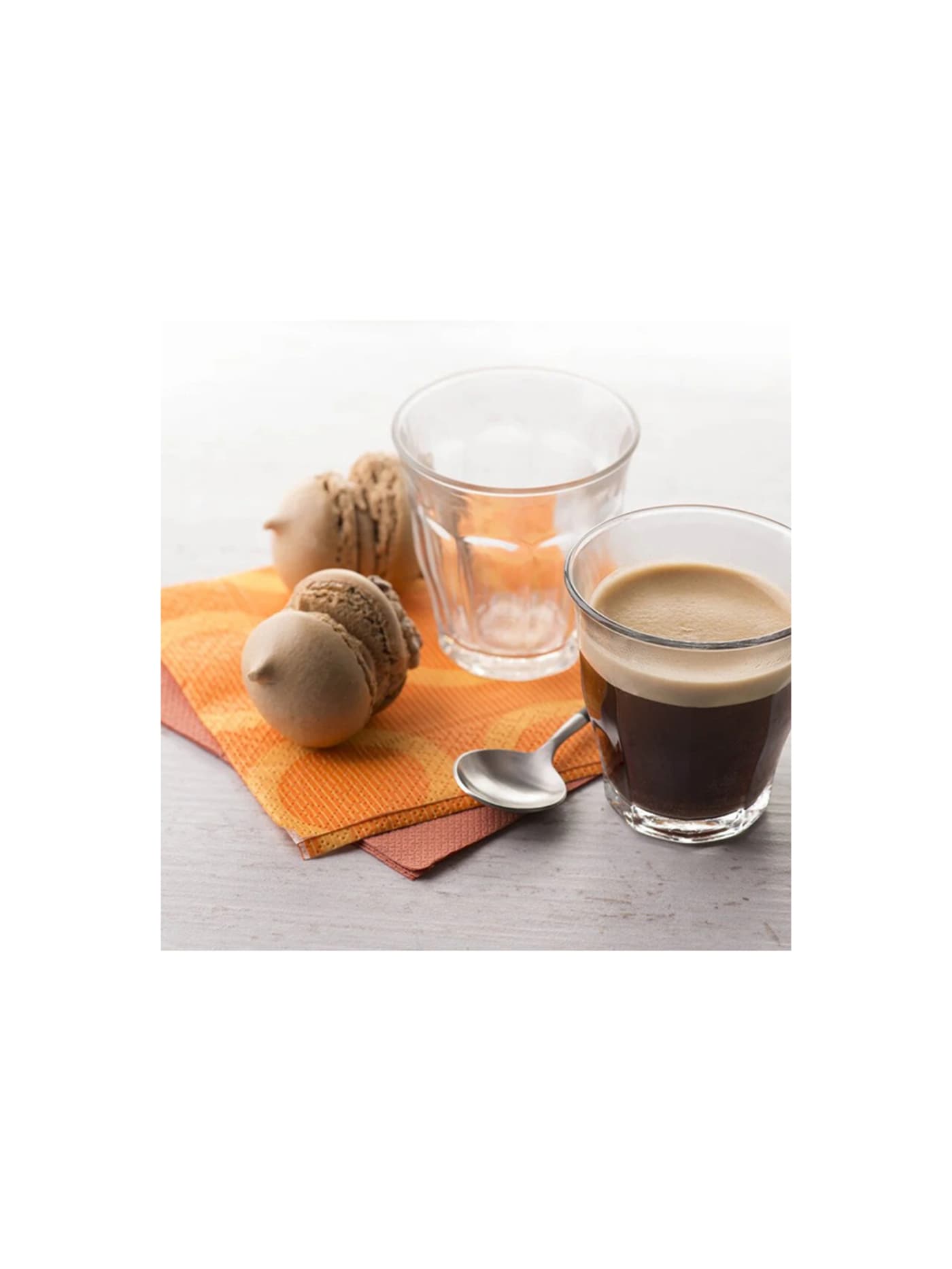

The tumbler in a thousand French cafés, and a lesson in how little a good glass needs to be. Tempering makes it roughly two and a half times stronger than ordinary glass and lets it go from freezer to dishwasher without complaint. The faceted profile stacks into a column that saves shelf space, and the same shape scales from espresso to water. When it does finally break, tempering means it crumbles into blunt granules rather than shards. Made in France since the 1940s and effectively unchanged, it asks to be used without care, which is close to the highest thing an everyday glass can offer. The trade is that it is heavier and plainer than fine crystal, and indifferent to occasions that want either. That indifference is the point.
Design intent
- The defining decision is the material: made from the tempered glass Duralex pioneered, the tumbler is heat-treated to roughly two and a half times the strength of ordinary glass and to withstand thermal shock, so a cheap everyday glass survives dishwashers, drops and hot-to-cold use that would destroy conventional glassware.
- The tapered, faceted form is quietly practical: it stacks and nests to save space, sits securely in the hand, and suits hot or cold drinks equally, a single shape that works across a café, a canteen and a home without pretending to be more than a glass.
Trade-offs
- Tempered glass cannot be repaired or re-cut, and although it resists breakage far better than ordinary glass, when it does go it fails all at once into granules rather than chipping, so it is designed to be replaced cheaply rather than kept forever.
- It is a plain, functional object with no pretension to luxury: the appeal is durability and honesty, not fine crystal, so anyone wanting weight, ring or refinement at the table is looking at the wrong glass.
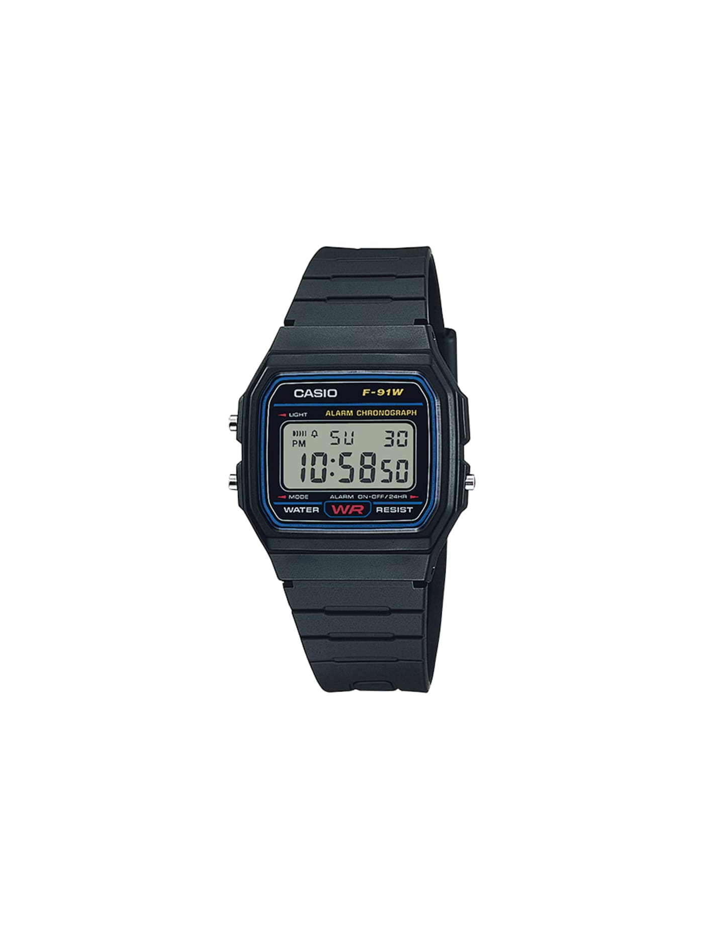
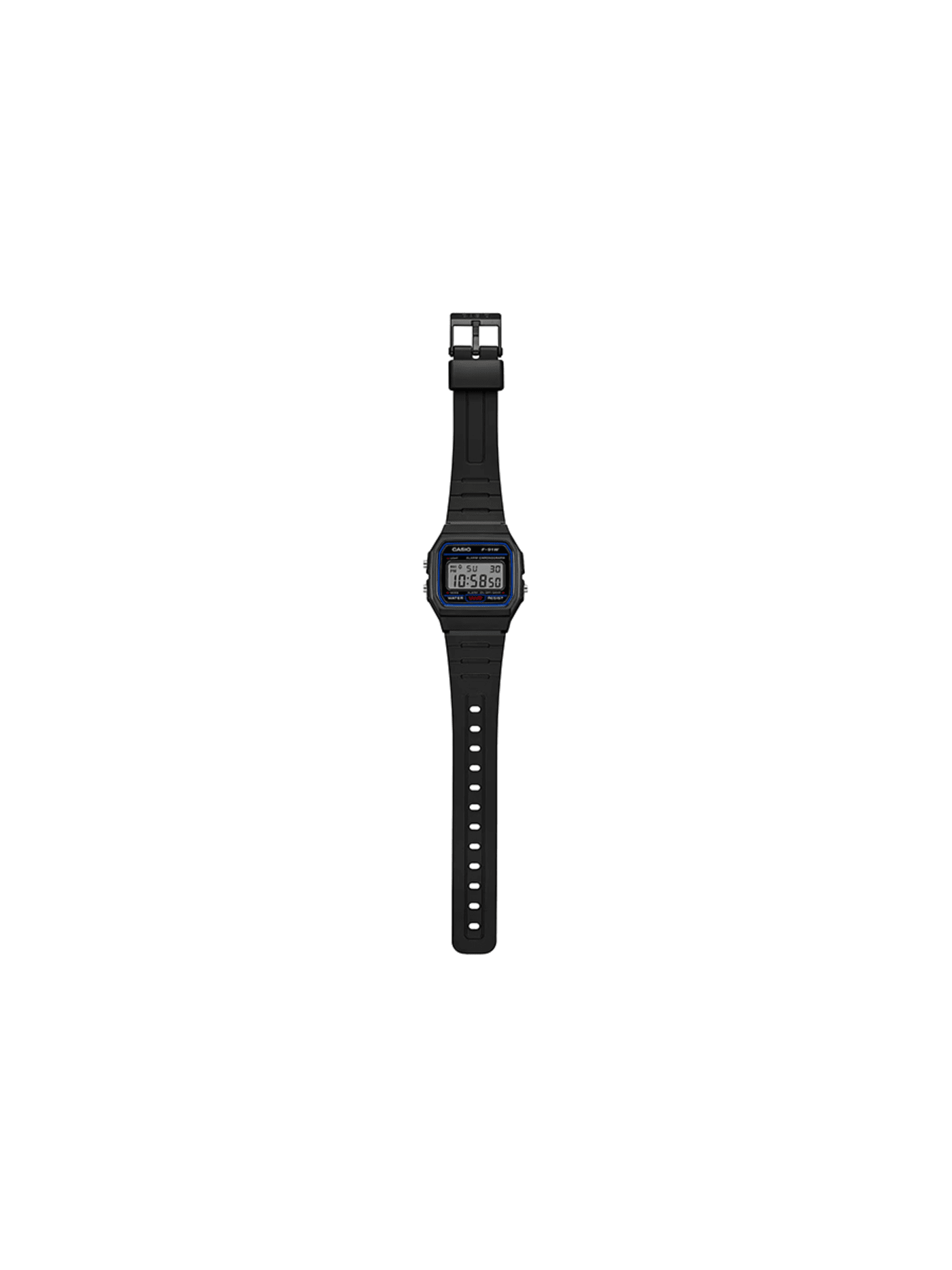
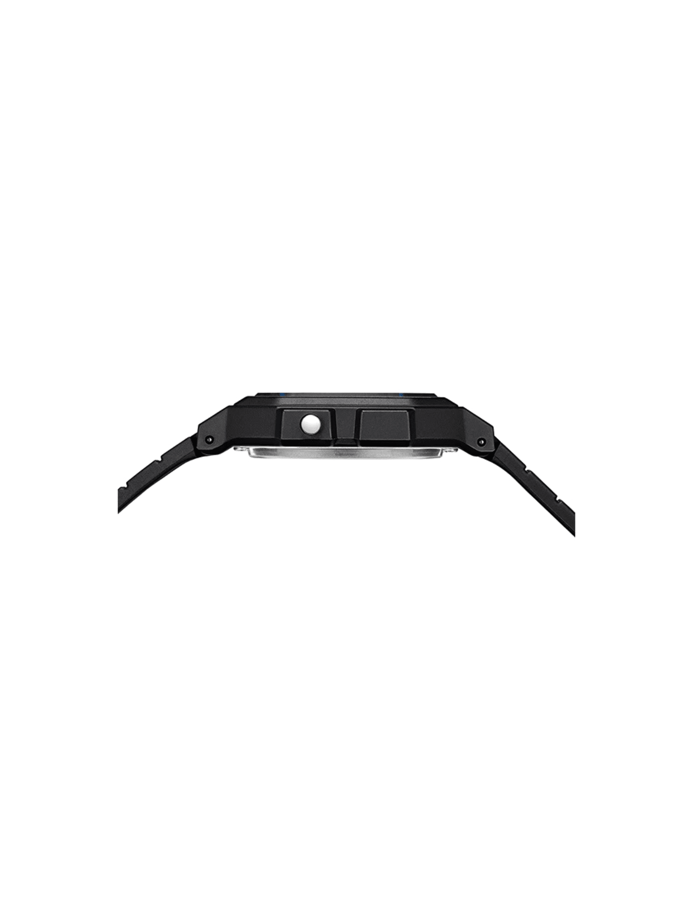
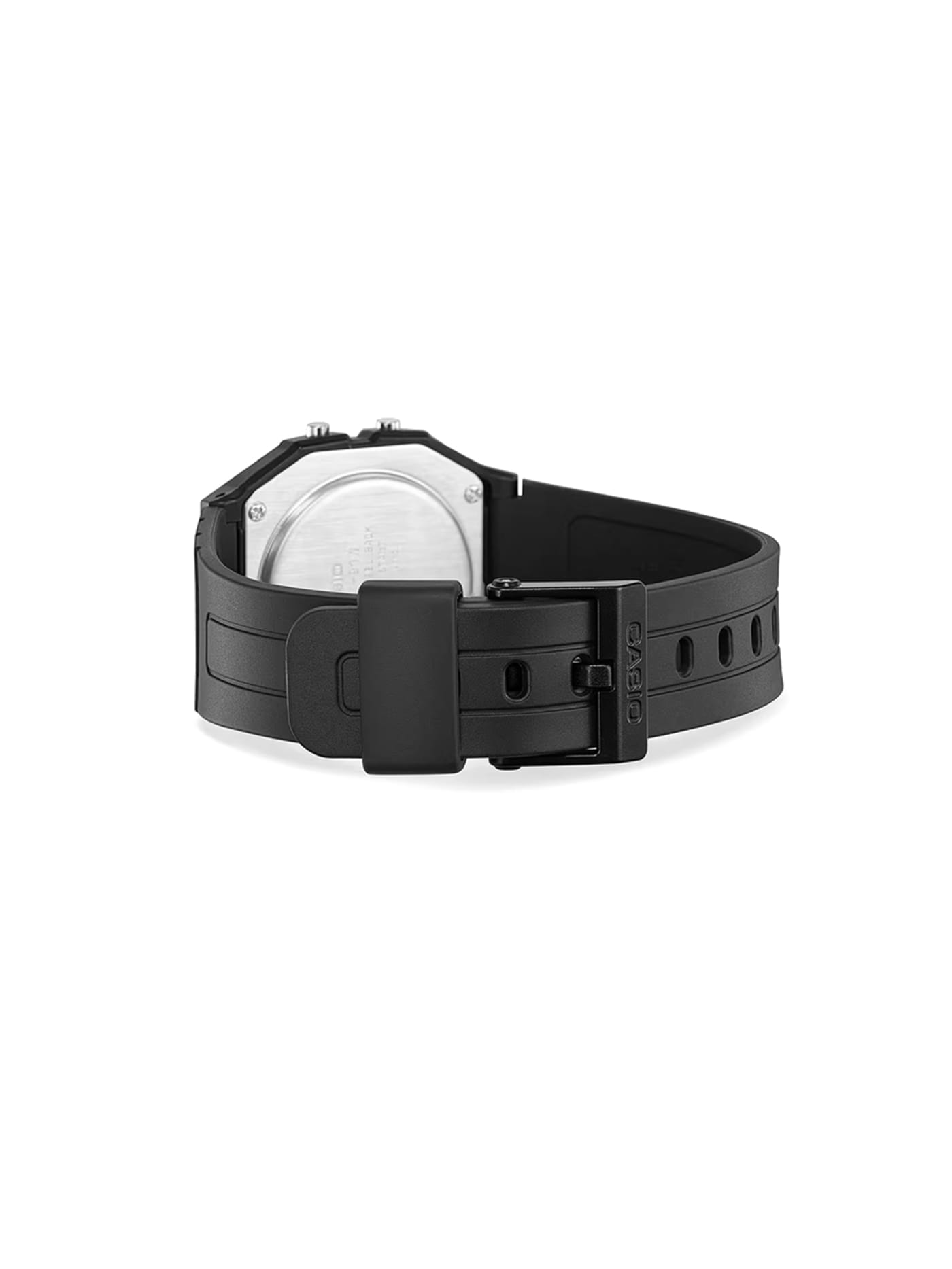
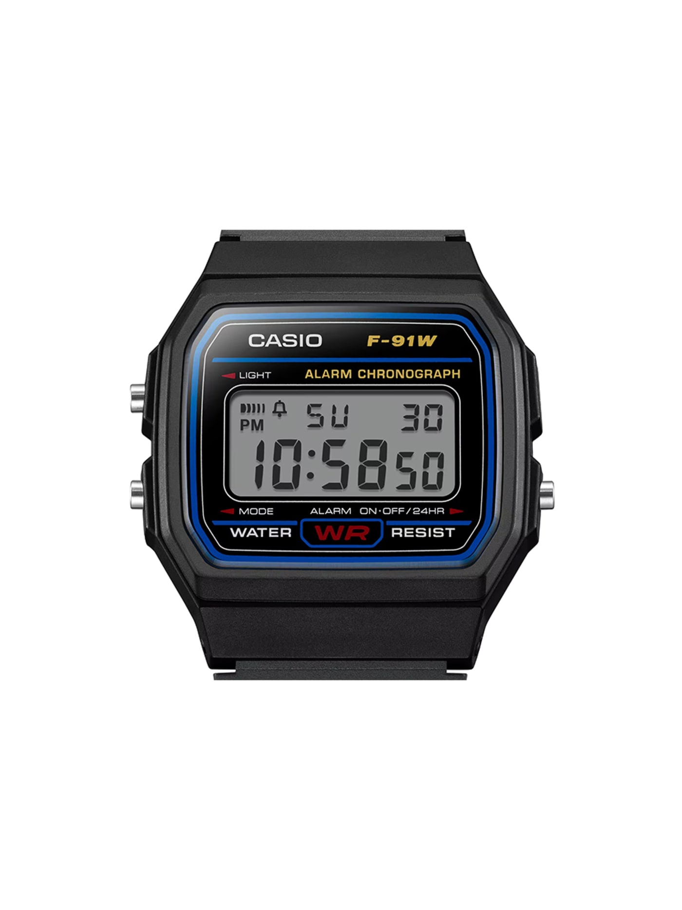
It appears elsewhere in the index for other reasons; on this list it earns its place on price alone. A resin case, a legible digital readout, an alarm, a stopwatch and a battery that runs for years. The whole object is edited down to the few things a watch is actually asked for, and priced accordingly. Nothing about it is refined, and that is the argument. There is no finish to wear off, no material pretending to be another, nothing to maintain. It keeps good time and asks nothing back. Against a smartwatch it offers no notifications and no nightly charging, which for a thing you only glance at is less a limitation than a relief. You can lose it without grief and replace it without thought.
Design intent
- Low cost and low weight are treated as features rather than compromises: a watch cheap enough that losing it carries no real penalty.
- The entire interface is three buttons with their functions printed on the face, operable without instructions and unchanged for over thirty years.
Trade-offs
- The resin case and acrylic crystal scratch easily, and the backlight is too dim to be useful in true darkness.
- No luminous hands, shallow water resistance, and a strap that grows brittle after years of UV exposure: predictable limits at the price.
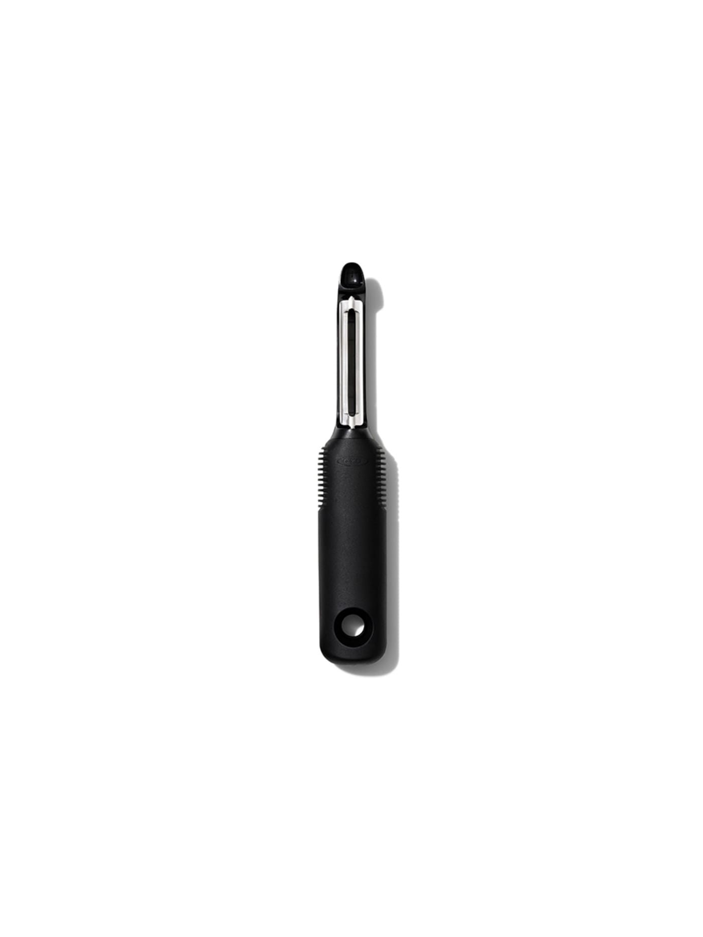
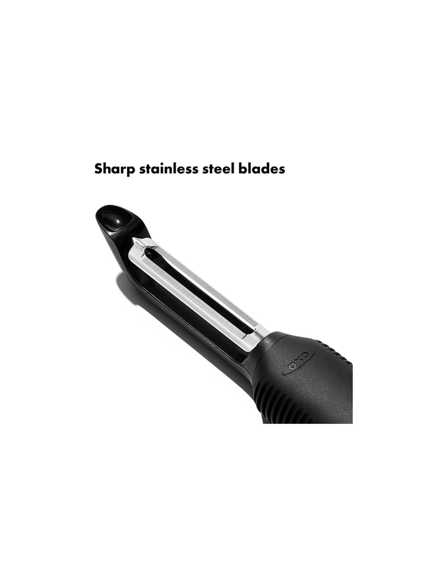

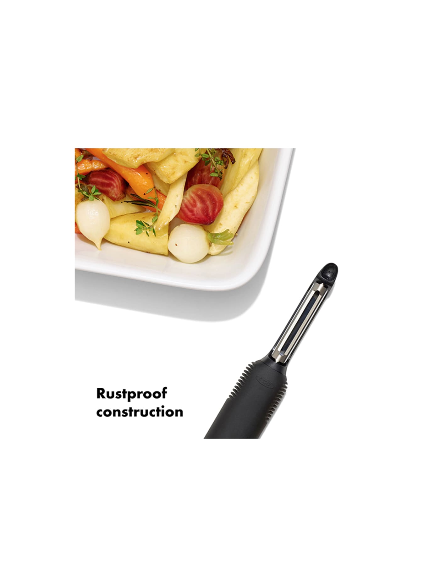


Conceived in 1990 after Sam Farber watched his wife Betsey struggle with a metal peeler her arthritis made painful to hold, and developed with the firm Smart Design. The soft oval handle, with its fanned rubber fins, was drawn for hands that hurt, and turned out to work better for every hand, wet or dry. That is the whole lesson of inclusive design in one cheap object: solve for the hardest case and the easy cases are solved with it. The blade is unremarkable. The handle is the design. It entered the Museum of Modern Art's collection in 1994 and still costs under a tenner. Its cheapness is not a compromise on the peeling. It is the removal of everything that was never the point.
Design intent
- The defining decision was to design for the extreme: built for a user with arthritis, the fat Santoprene handle with its flexible fins gives grip and comfort that happen to make the peeler better for every hand, wet or dry, weak or strong, the founding example of inclusive design.
- The innovation is concentrated entirely in the handle, leaving the humble swivelling stainless blade unchanged, so an ordinary, inexpensive tool is transformed by rethinking only the part that meets the hand rather than reinventing the whole object.
Trade-offs
- The swivel blade is fixed and not meant to be replaced, so when it dulls after years the tool is renewed rather than resharpened, which suits its low price but makes it a long-life consumable rather than an heirloom.
- The soft grip that defines it is a synthetic rubber that can, over many years and with heat or oils, eventually degrade or grow tacky, the one part whose ageing is less graceful than the steel it is paired with.
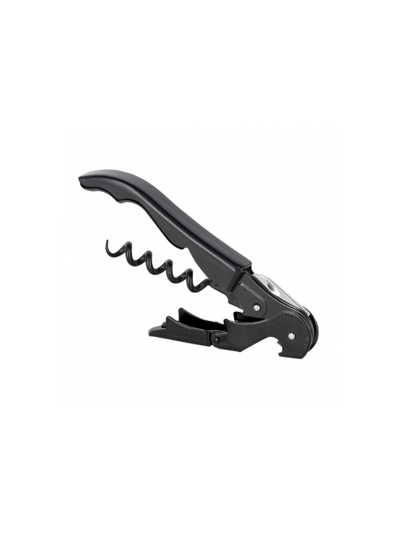


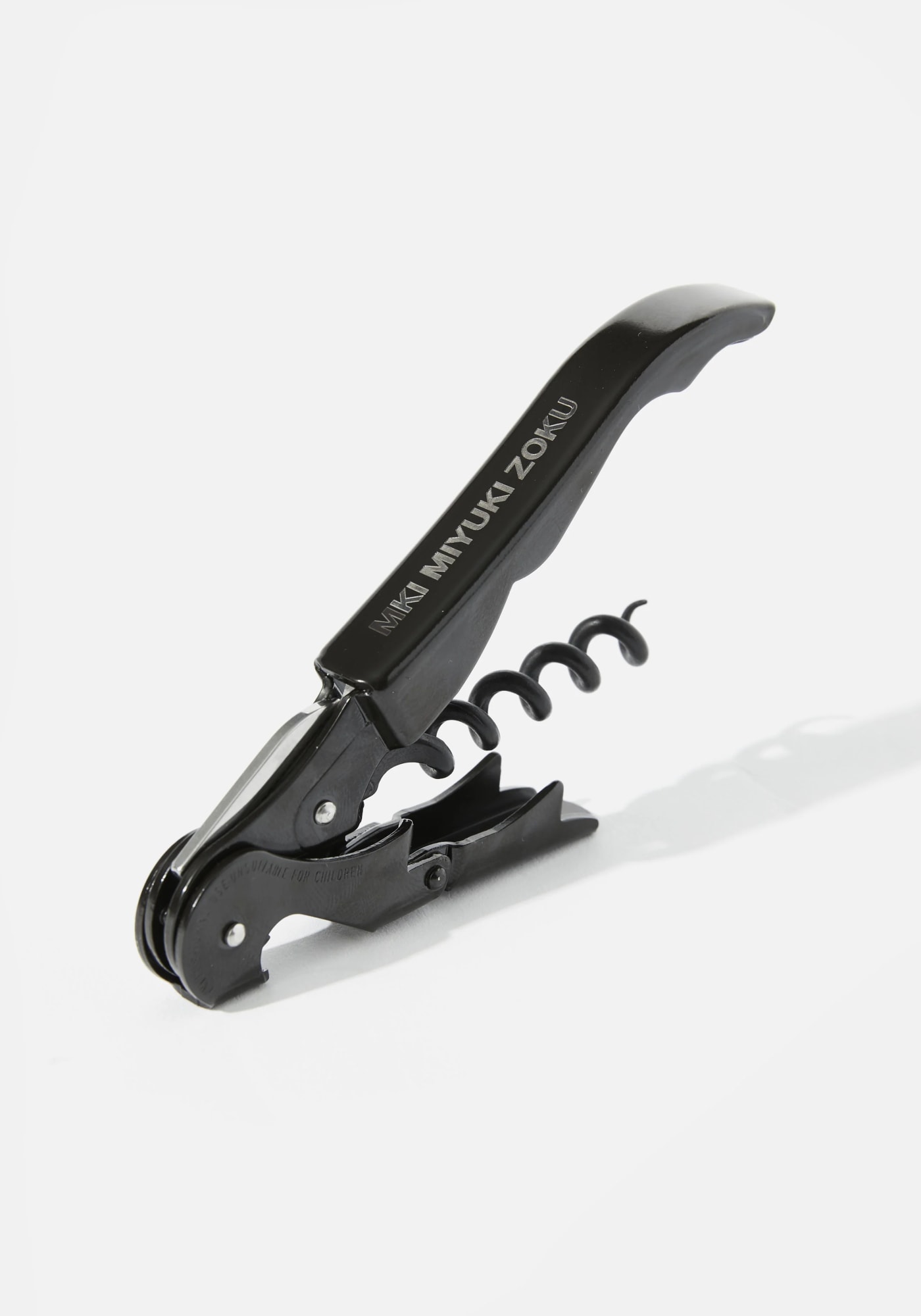
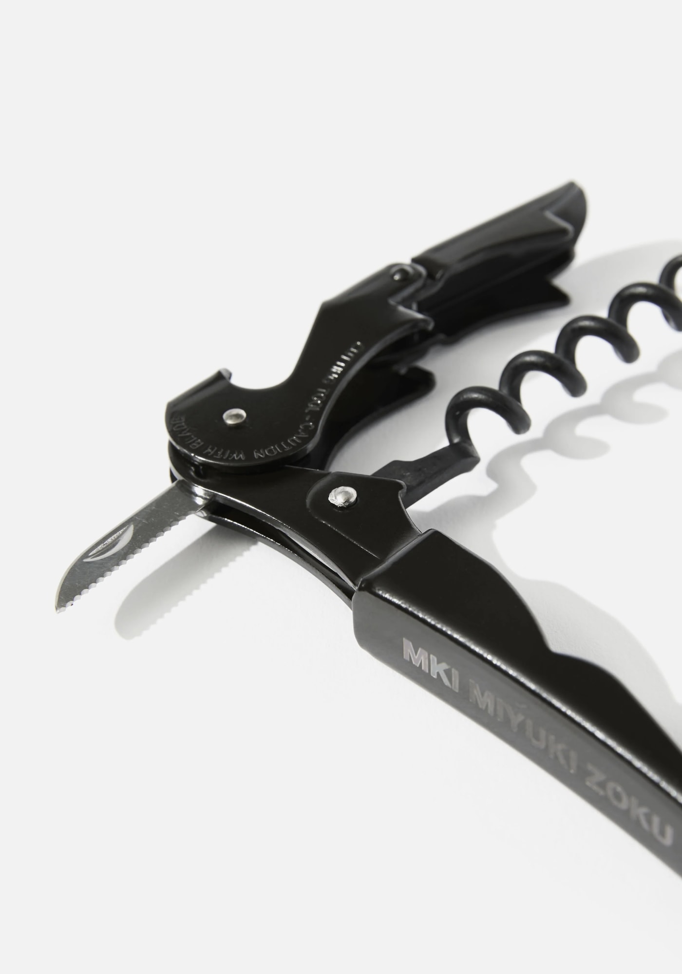
The waiter's friend, refined to the point where sommeliers and bartenders reach for it over anything dearer. Its one idea is the two-step hinge: a lever that seats on the bottle lip, draws the cork halfway, then re-seats on a second notch to finish the pull without bending the cork or straining the wrist. That two-stage fulcrum is the entire design, and it does the job more cleanly than corkscrews costing many times more. Everything else folds flat into a body the size of a pocket knife. The trade is that it asks for a little technique; the first pull can tear a fragile cork if it is rushed. But the technique is learned once and kept for life.
Design intent
- The double-hinged fulcrum turns extraction into two short, leverage-efficient pulls one hand can manage while the other steadies the bottle: a real mechanical gain over the single-notch waiter's key, not a styling difference.
- The Teflon-coated worm is a deliberate choice for a tool opened dozens of times a shift, lowering insertion resistance and the fragmentation that breaks corks.
Trade-offs
- The second hinge adds a pivot that eventually works loose under heavy daily use, the Classic 500's usual point of failure over years of service.
- The two-stroke sequence is unforgiving for an occasional user who does not know it; the first few openings can feel awkward before the rhythm sets in.
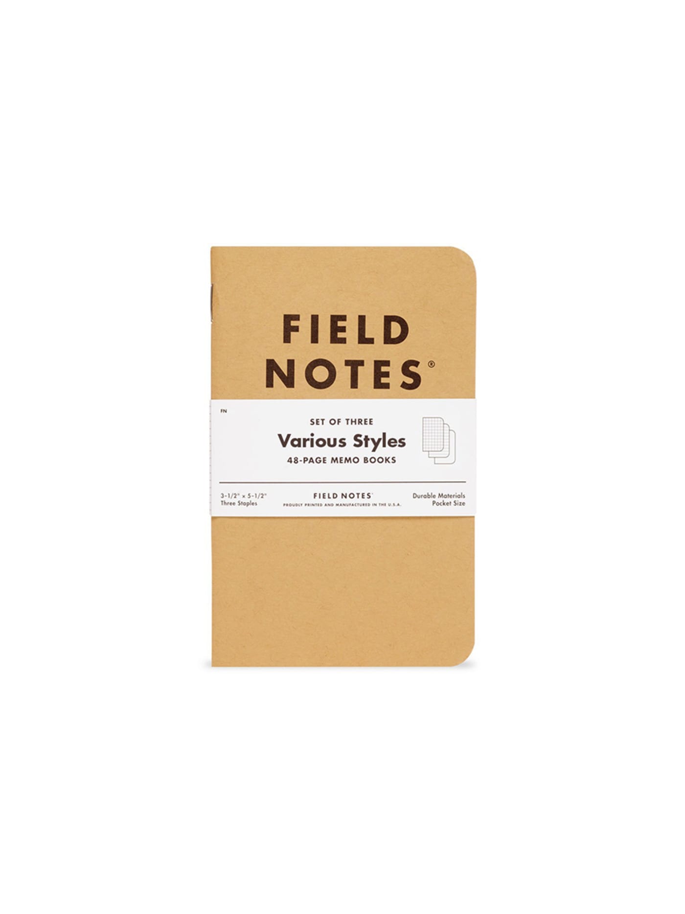


A forty-eight-page memo book in a kraft cover, sold in packs for about the price of a sandwich. It appears elsewhere in the index for how it carries; here it stands for a rarer quality, a notebook cheap enough to actually use. Precious notebooks get preserved. This one gets filled, because losing it costs nothing and finishing it is the point. The cover softens, the corners round, the staples hold. It is not weatherproof and it is not archival, and neither matters, because it was designed to be used up and replaced rather than kept. The limitation is the invitation.
Design intent
- Selling in three-packs normalises replacement and strips away the preciousness of a single notebook, so the format encourages use rather than preservation.
- The kraft cover is thick enough to survive a pocket without a sleeve and thin enough to add no real bulk, calibrated to carry rather than to a desk.
Trade-offs
- The 60lb paper handles pencil and most pens but will feather with wet fountain-pen inks and bleed under markers; it optimises for cost and portability over ink range.
- The staple binding has a finite flex life and will loosen with heavy use, consistent with the disposable premise but worth knowing.
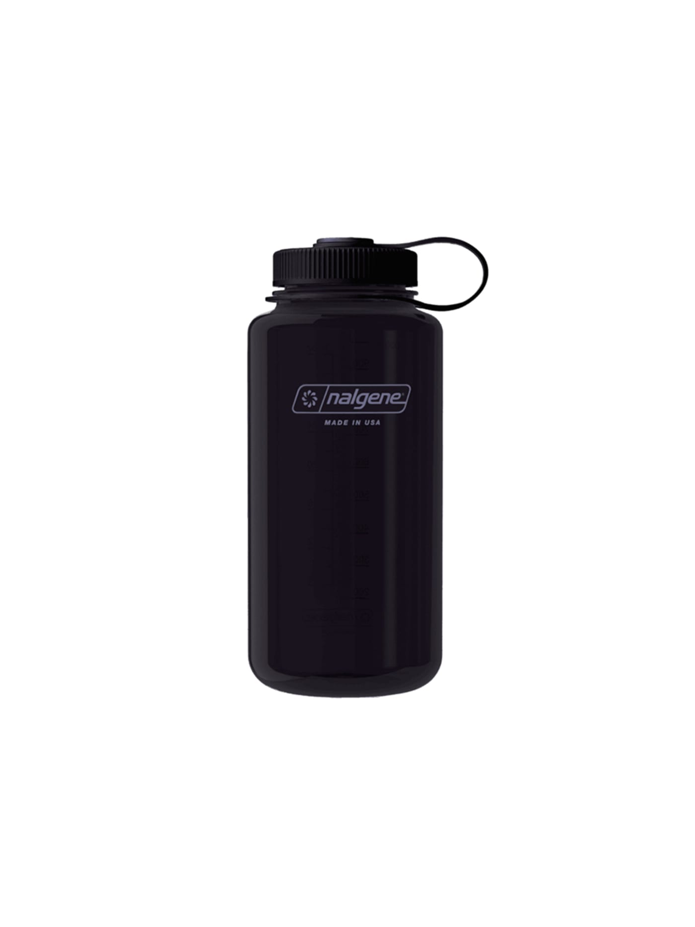
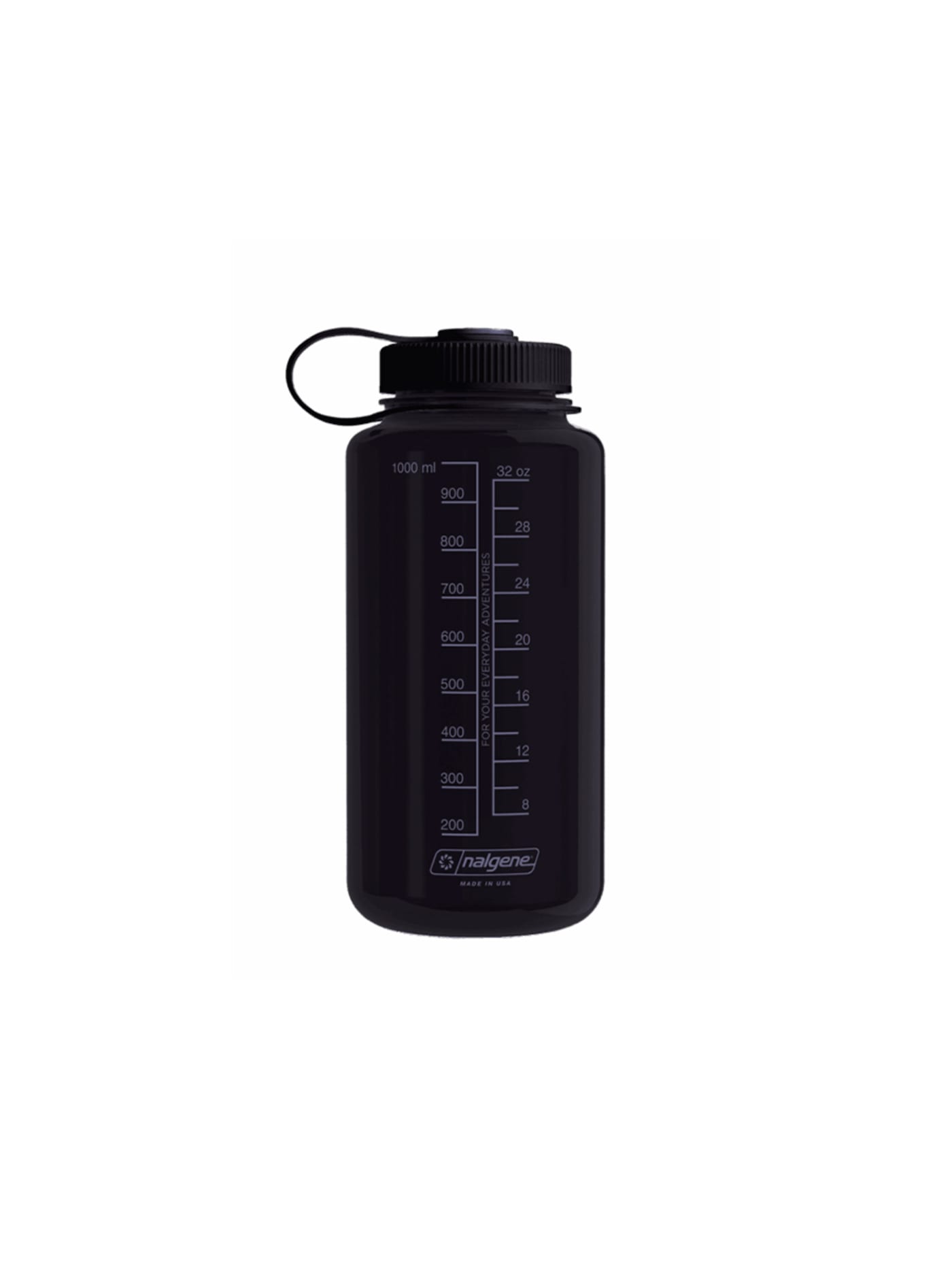
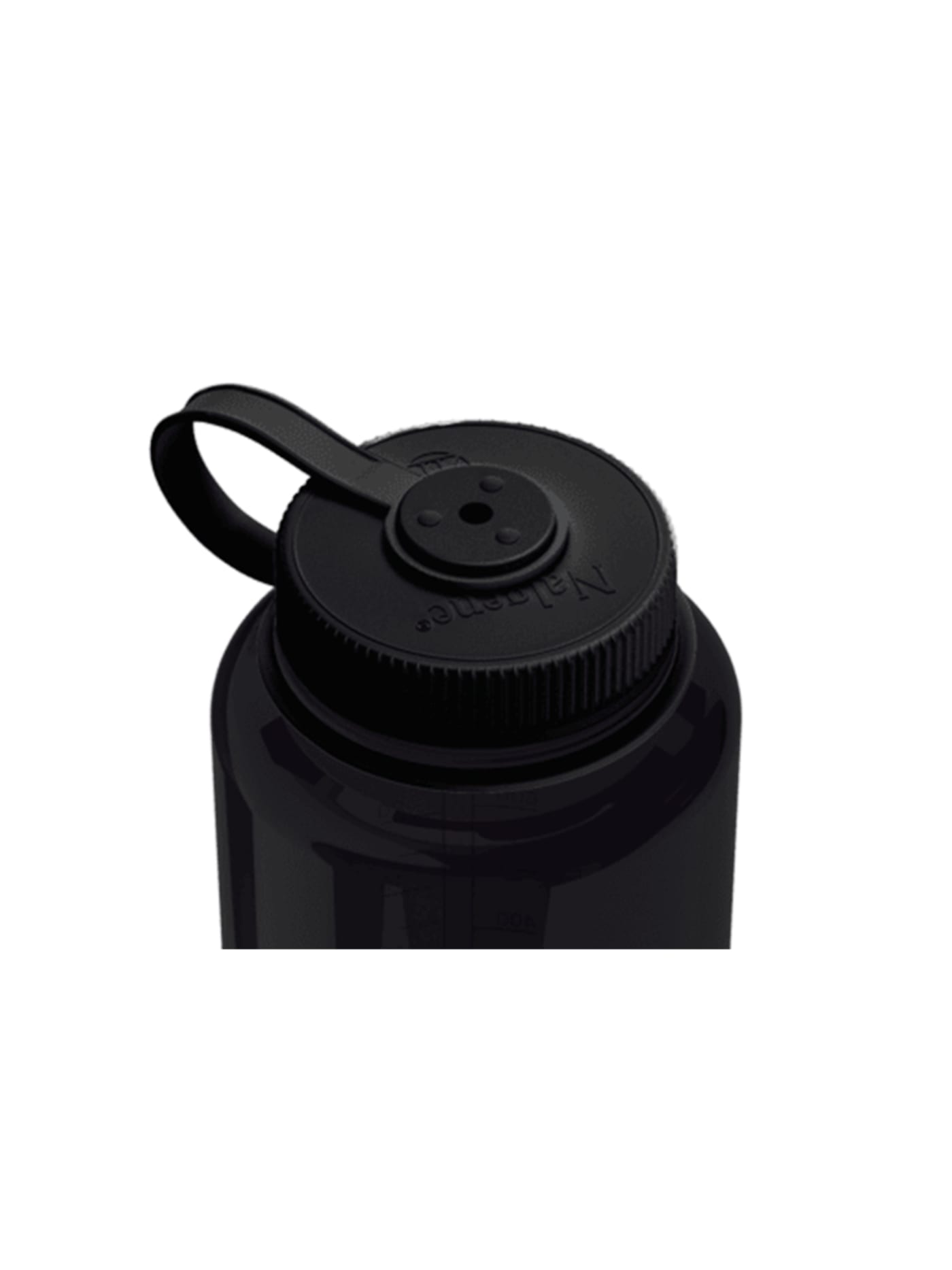
Born in a laboratory rather than an outdoor brand, which is why it is honest to the point of bluntness. A single piece of moulded copolyester, a wide mouth that takes ice and cleans easily, graduations moulded up the side, and a leash-tethered lid so the cap cannot wander off. There is no double wall, no vacuum insulation, no finish to scratch. One material doing one job, effectively indestructible, and priced like the lab equipment it descends from. Against an insulated flask it keeps nothing hot or cold, which is the trade: it is a vessel, not a system. What it offers instead is decades of use for the price of a round of coffees.
Design intent
- The 63mm wide mouth is a deliberate compatibility decision, accepting most inline filtration devices directly, which matters wherever tap water cannot be trusted.
- Tritan Renew at 50% recycled content uses chemical rather than mechanical recycling, so the material keeps virgin Tritan's strength while cutting fossil input; the bottle performs identically to the original.
Trade-offs
- At 177 grams it is heavier than ultralight bottles; it trades packweight for durability and filter compatibility, and gram-counters will look elsewhere.
- The single-wall cylinder is uninsulated and sweats in humid heat; it is built for toughness and easy cleaning, not temperature retention.
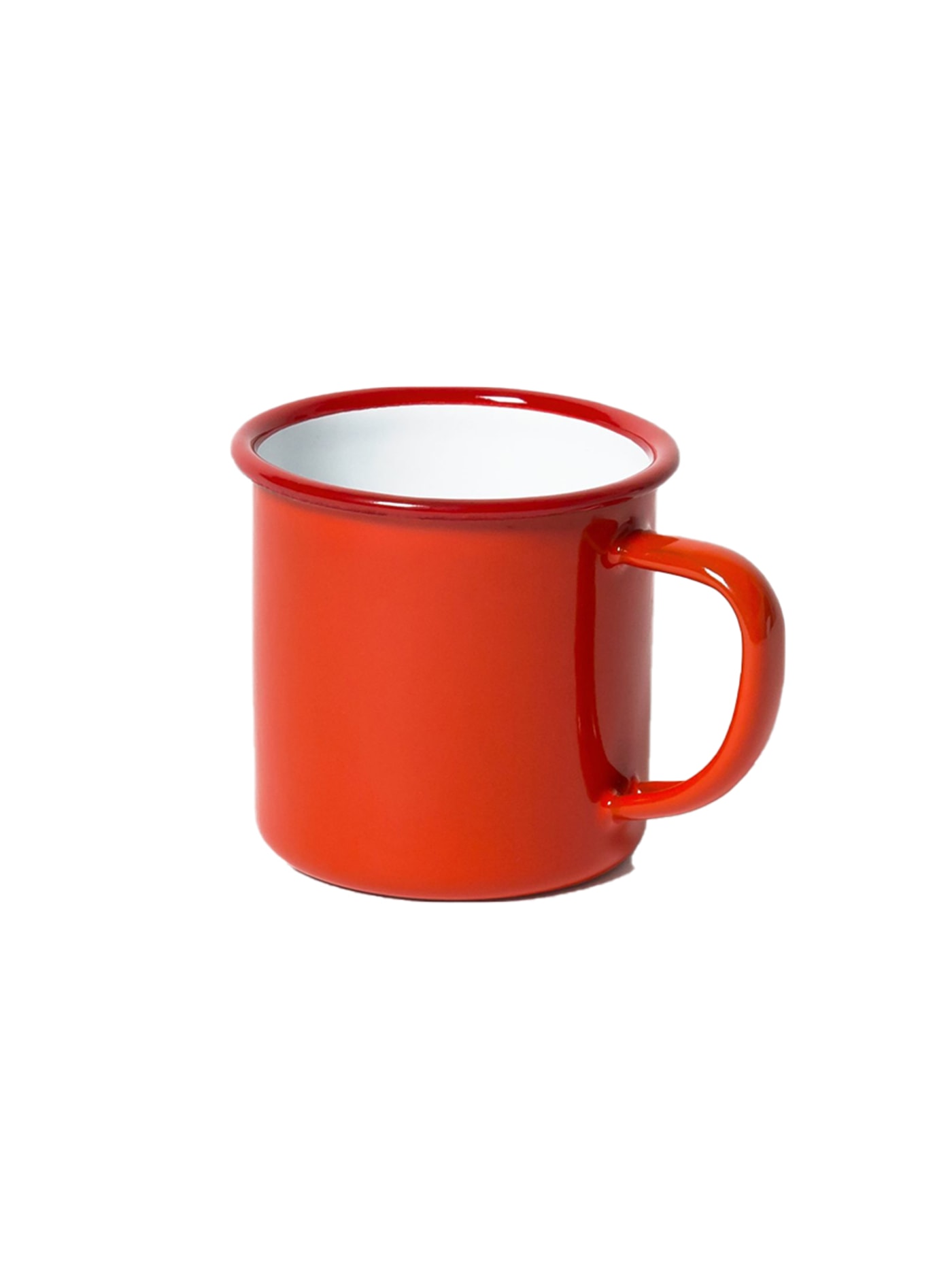

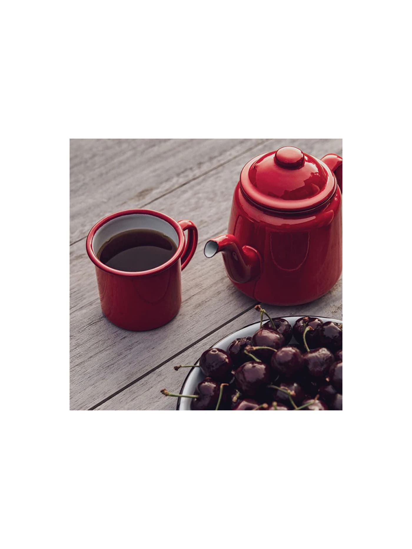

Porcelain enamel fused onto heavy-gauge steel, made in the Black Country since the 1920s and barely altered since. The material is the whole argument. It cannot burn, will not hold a flavour, and shrugs off treatment that would chip a ceramic mug into the bin. Drop it and it may chip to the steel beneath, but the chip is honest, a mark of use rather than a failure, and the mug goes on working. It conducts heat, so a full one is warm to hold, and the enamel will craze in time. Both are the terms of the material, stated plainly, which is exactly what enamel has always done.
Design intent
- The material is the whole argument: vitreous enamel fused onto heavy-gauge steel gives a mug that cannot burn, is chemically inert and takes heat from a hob or open fire, so a cheap object behaves like serious equipment rather than fragile crockery.
- The design treats wear as character rather than failure: the signature blue rim is where the enamel will eventually chip, and the mug is built to keep working, and looking right, once it does, so its life is measured in decades of use rather than a pristine surface.
Trade-offs
- Enamel on steel will chip if knocked hard enough, exposing the steel beneath, which can then mark, so the honesty of the material comes with visible ageing that some will read as damage rather than patina.
- As bare metal it conducts heat, so a hot drink warms the rim and body more than a ceramic mug would, and the heritage now sits alongside manufacture that has moved abroad, a shift from its Black Country origins.


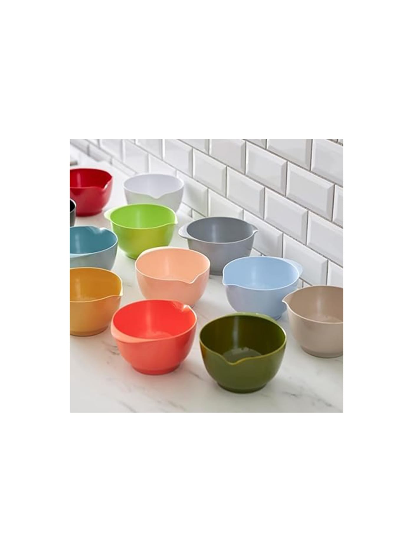
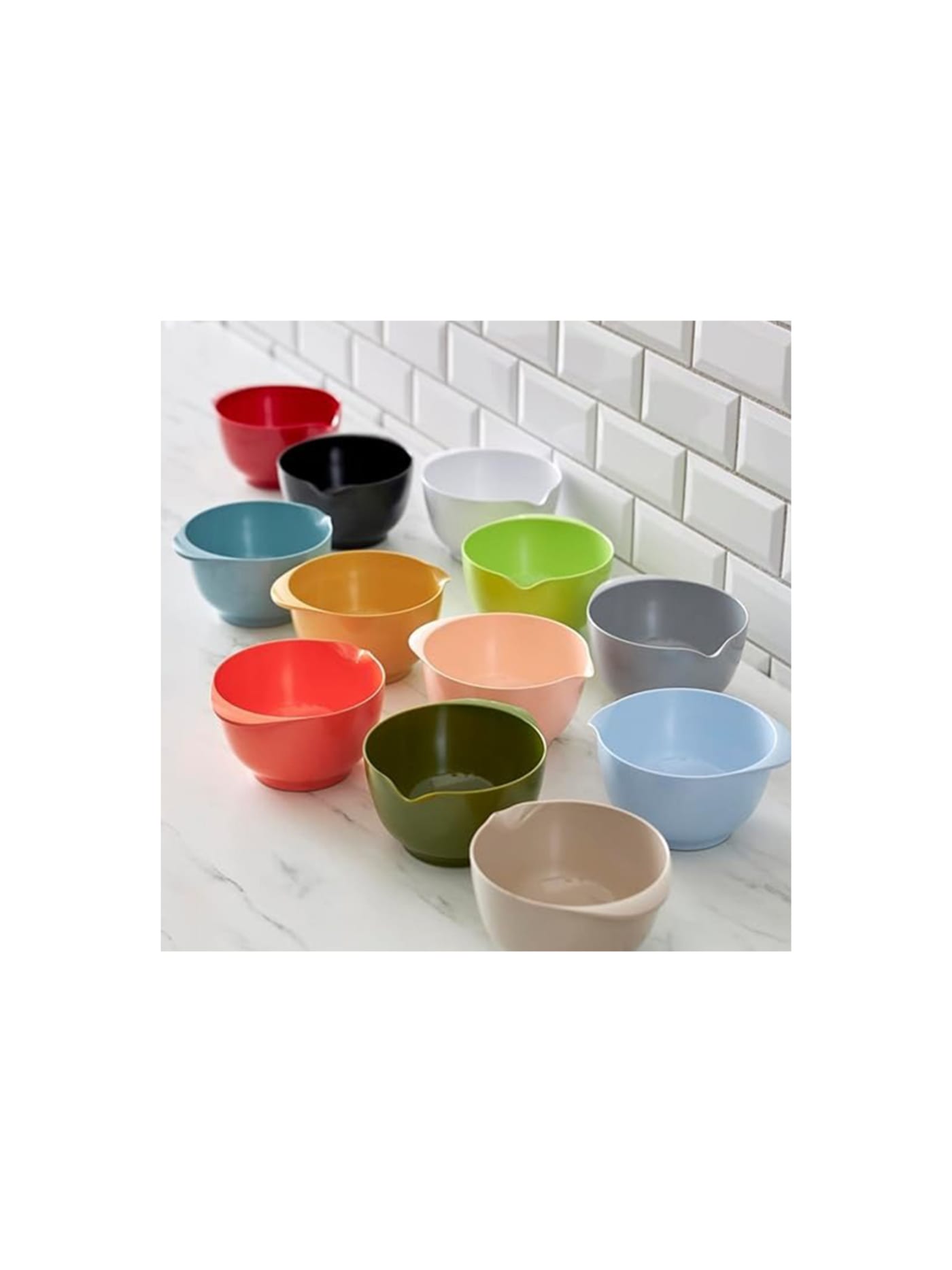
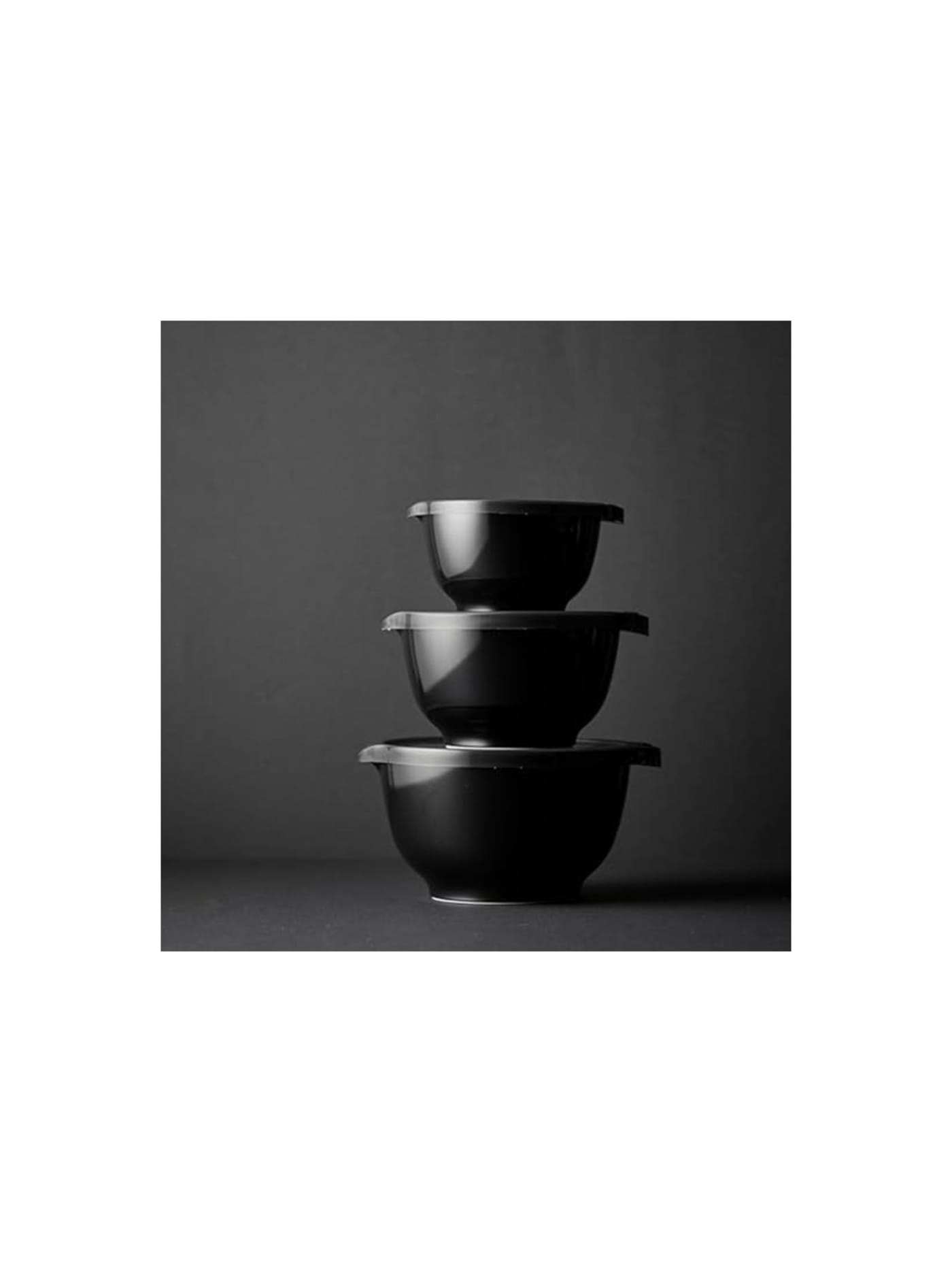


A melamine mixing bowl designed by Bernadotte & Bjørn, Scandinavia's first industrial-design studio, and in production since 1950. Almost every part of it is a quiet solution: a pouring lip so a batter leaves cleanly, a ring of rubber at the base so the bowl holds still while you whisk one-handed, sloped sides that gather the mix, and a profile that stacks. None of it announces itself, which is why it has stayed in kitchens for seventy years and sold in the tens of millions. Melamine is the trade. It is light and near-unbreakable, but it will scratch and dull with hard use, and it is not for the oven. Within those limits, it is close to a solved object.
Design intent
- Every element of the bowl is problem-solving rather than decoration: the moulded handle and wide rim give a secure hold, the spout pours cleanly, the profile nests for storage, and the base ring grips the counter so it can be used one-handed, a set of small decisions that together make mixing genuinely easier.
- Choosing melamine was the enabling decision: a dense, shatterproof, scratch-resistant material gave the bowl real weight and durability at low cost, so an everyday plastic bowl feels substantial and lasts for decades rather than reading as disposable.
Trade-offs
- Melamine is durable but not heatproof: the bowl is made for mixing, prep, storage and serving, not for the oven or prolonged high heat, so it trades all-purpose cooking use for its lightness and colour.
- Over many years the surface can lose its sheen and, if cracked, melamine should be retired, so while it lasts remarkably long it does age, and a chipped or crazed bowl is replaced rather than repaired.
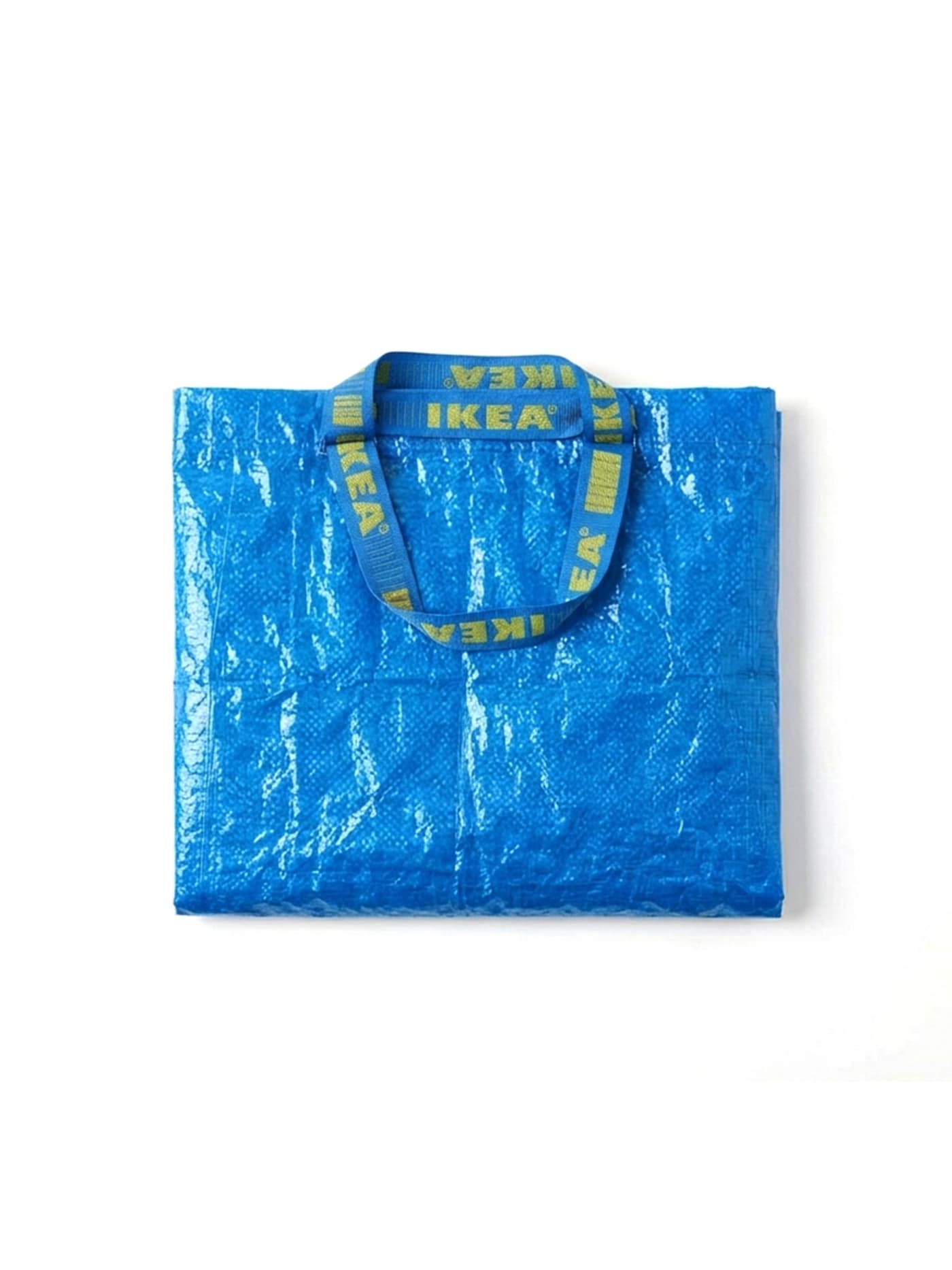
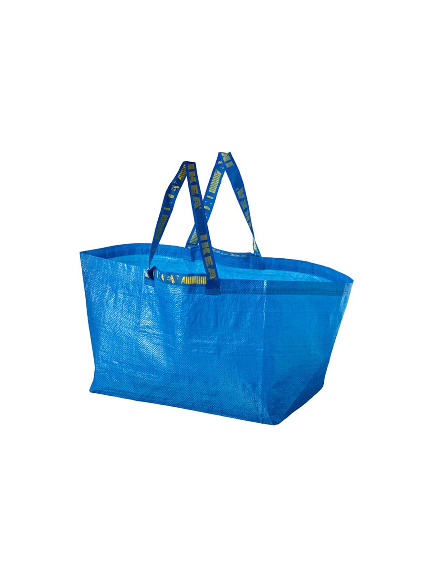
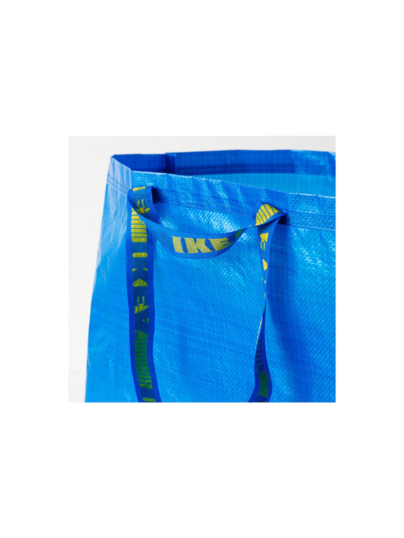
The most-analysed shopping bag ever made, and one of the cheapest objects in any shop that sells it. Woven polypropylene, welded rather than stitched at the stress points, with two pairs of handles, short for the hand and long for the shoulder, and a flat base that lets it stand open while loaded. It folds to nothing, carries a heavy load without protest, and wipes clean. There is no lining, no fastening, no structure beyond what the load itself provides, which is why it costs about the same as the carrier bags it replaces and outlasts all of them. The trade is obvious and accepted: it is unlovely, and it protects nothing it carries. It simply moves things, reliably, for years.
Design intent
- The single woven-polypropylene construction is honest to the point of bluntness: it does not absorb liquid, does not pretend to be fabric, and what it is and what it does are the same thing.
- At 71 litres and folding flat, it costs almost nothing to keep ready, so a serious carrying capacity lives in a drawer until it is needed.
Trade-offs
- With no structure the bag conforms entirely to its contents; it offers containment, not protection or organisation.
- Polypropylene does not age gracefully: prolonged UV makes it brittle, and it eventually cracks rather than developing any patina of ownership.


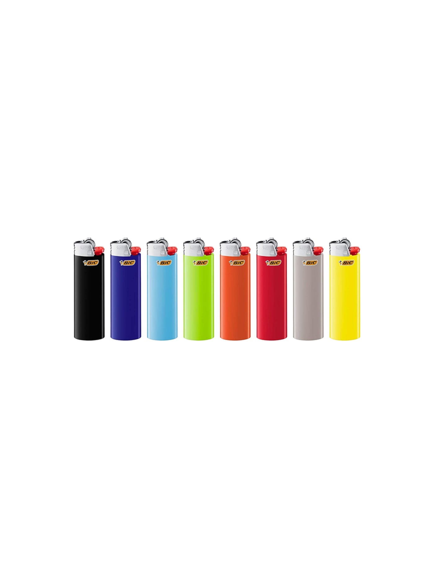
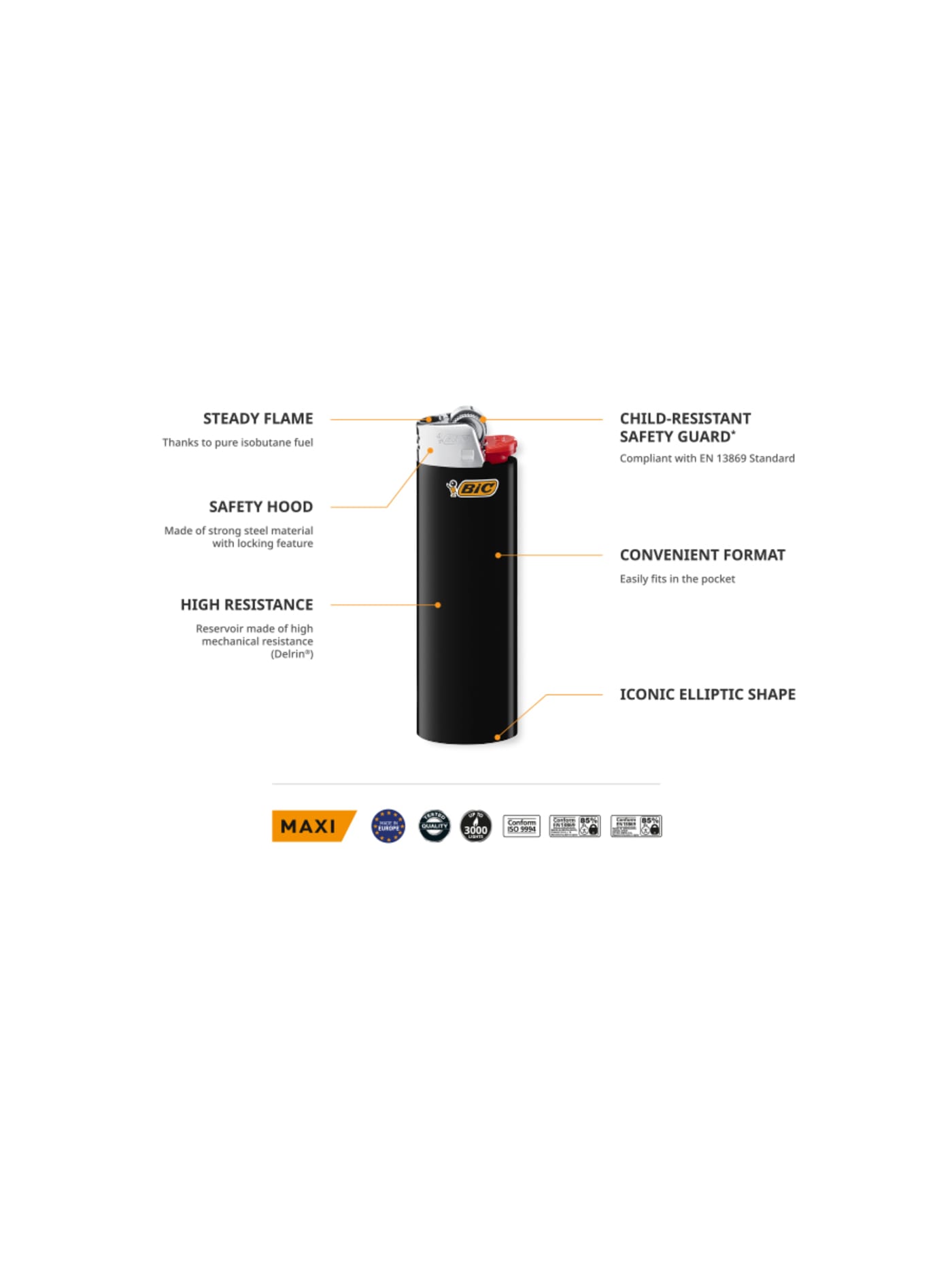
A disposable lighter engineered with a seriousness its price hides. The metal spark wheel strikes the same way after thousands of uses, the flame is adjustable, the fuel level is legible through the body so it never dies unannounced, and the whole thing is built to a guaranteed number of lights before it is spent. It is overbuilt exactly where reliability matters and stripped of everything else, which is why it has outlived most of the refillable lighters meant to replace it. The trade is that it is, by design, thrown away, a resolved object with a deliberately finite life. Within that life it simply works, every time, which is more than most tools at any price manage.
Design intent
- The flame is deliberately non-adjustable and pre-set to a fixed height: removing the adjustment removes a control to misuse, a variable to get wrong and a part that can fail, while guaranteeing the same flame on the first light and the three-thousandth.
- The body is moulded from Delrin rather than a cheaper general-purpose plastic, a choice driven by safety: the resin holds pressurised fuel and resists impact and heat where a softer polymer could not, which is what lets the object be both disposable and trustworthy.
Trade-offs
- It is built to be discarded: the Delrin body and metal parts are not meant to be separated, so a spent lighter is awkward to recycle and rarely refilled even though it can be. At Bic's scale, that disposability is a significant material cost.
- The child-resistant steel band over the flint wheel adds friction to ordinary use, stiff enough that many adults simply prise it off. The safety the regulation intended is real, but so is the everyday annoyance it creates.
Final thoughts
None of these objects is cheap because someone cut a corner. They are cheap because there was nothing left to add, and because being made in enormous numbers forced out everything that did not earn its place. That is a harder discipline than a high price ever imposes.
An expensive object can hide a weak decision behind finish and material. These cannot. Every one of them is exposed, made for pennies, produced by the million, and still standing after every cheaper imitation and dearer alternative has come and gone.
Read them the way you would read anything: what is this for, and does every part of it serve that purpose. The answers do not change when the price is low. We are simply less inclined to look, which is exactly why the best-designed object in the room is so often the one nobody thought to examine.